In this blog post I’ll explain how you can hack a chord diagram to shape it into a more circular looking sankey-like flow chart. Why not just take a regular sankey to visualize the flow? Well, the visualization was meant for use in the media to engage the viewers. Therefore, I wanted to create something visually different. In the end it appears that I just wanted to challenge myself and dive into the d3 source code (for the first time).
I’ve you’re just interested in the final code to recreate it yourself, scroll down to the last section where you can find a link to a working example. Otherwise, read on if you want to understand how it was made.
The idea
At Deloitte, I worked on the State of the State project in which several small teams of data analyst and subject experts try to answer questions with actual (open) data that arise due to new rules or regulations of the government. For example, if a politician says that there are more than enough empty office buildings in the Netherlands so we should shut down any plans for building new homes in cities, we try to see if that is really viable. How many square meters is empty? How many of these buildings are even good enough for transformation to apartments (not too old or new, not in an industrialized zone, not too small, etc.)? How much is each city expected to expand in population in the next 10 years. Besides Housing, there are three more subjects: Health, Education and Labor.
I have no idea how to translate MBO & HBO. Its the two levels below University that you can take after completing High School. By completing HBO you have a degree that is the same as a University Bachelor, although the teachings are more practical than at a University. MBO is the level below HBO
The hacked Chord Diagram became part of the Education track. Do students really end up in the occupations that they studied for? And how is the new population of graduates divided among the occupational sectors? What % become teachers for example? To answer these questions we had access to a survey that is held amongst all students from MBO & HBO about 1.5 years after they graduated. We had the 2014 results which were filled in by ~40% of the graduated population in 2013; about 18,000 respondents for HBO and 21,000 for MBO. Through the survey, we knew on a case by case basis what each respondent had studied and in what sector there were currently working.
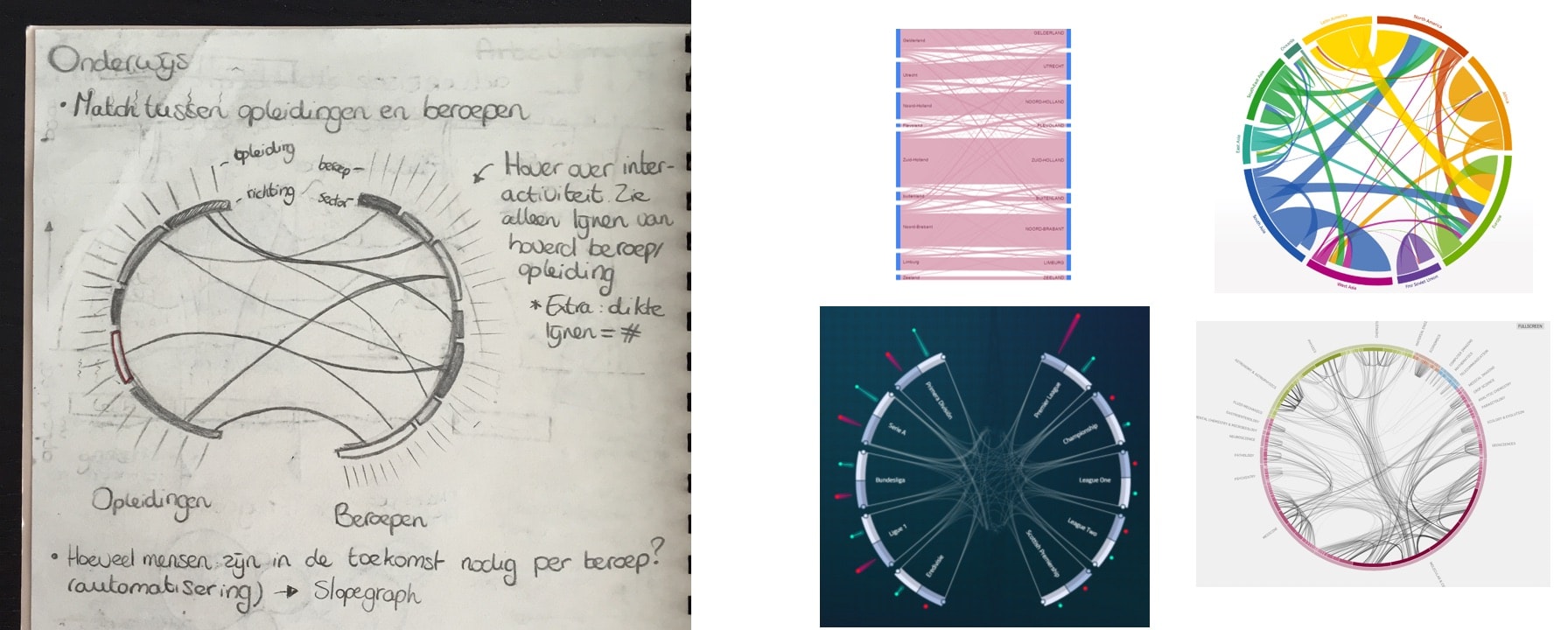
To visualize this flow between education and occupation I started drawing some ideas, one of which was a flow chart like a sankey, but more circular. Where the two halves of the circle are slightly pulled apart to distinguish them as different groups and there are lines connecting different sciences to different occupations. My manager was immediately drawn to this idea. However, then I had to figure out how to make it… (I was not at all sure that I could create it when I showed the design to the manager)
The result
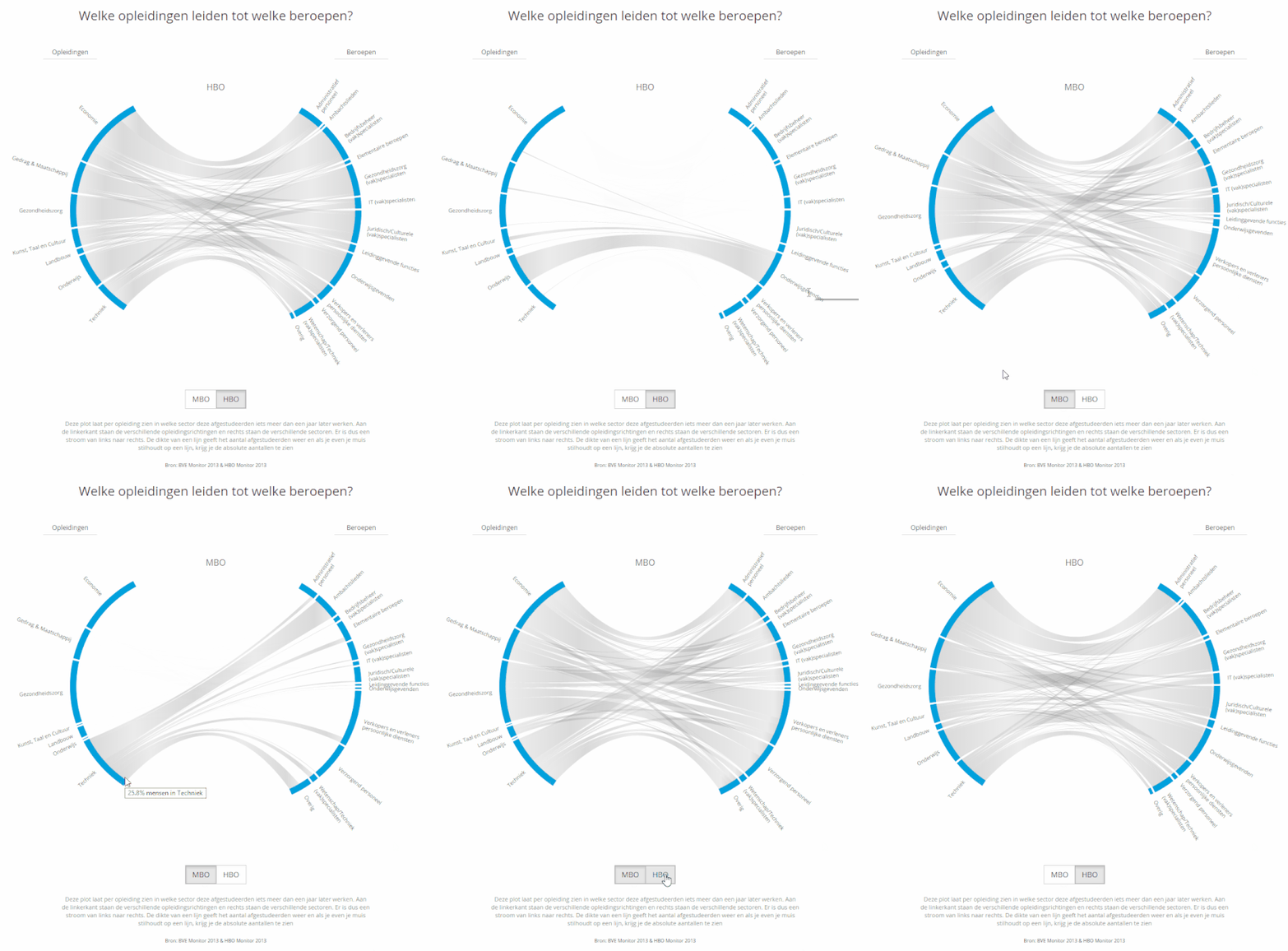
Because the tutorial that explains how to create the chart is quite long, I’ll just go right ahead and show you the end result that eventually can be found on the State of the State website. We had data for two different educational levels, therefore I also had to incorporate a data change into the script. I’m extremely grateful that AmeliaBR wrote a very extensive explanation on how to do it with chord constancy. I still only truly understand about half of her script after adjusting it to fit with the rest of my code, but at least it works (*^▽^*)ゞ
A user can now switch between MBO and HBO by clicking a button right below the visual. Since HBO is a higher level than MBO the management functions get a larger share of the students while the salesmen and service providers shrink quite a lot compared to MBO. Below you can see a short animated gif of the change from MBO to HBO. I’m sorry that the language is in Dutch, that’s why I recreated the HBO version in English at the top of this page. Besides the option to change between MBO and HBO, I also included a subtle flow into the grey fill of the Chords themselves. It doesn’t work in IE ಥ_ಥ but in the other browsers it is meant to slightly hint at a flow from left to right.
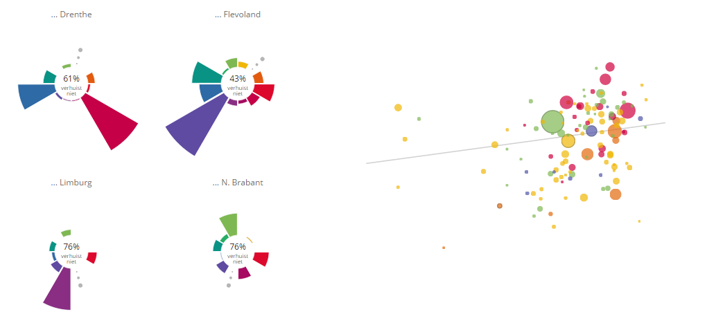
The full education track is filled with several more charts, but I’ll discuss those in a later project page. I’ve already made a blog post about improving the user experience by using invisible voronoi cells on mouseover events on a scatterplot, which I also used a lot in the State of the State visualizations
The math
On to the tutorial. Since I wanted to have an interactive chart, I knew that d3 was probably the way to go. Looking at the base charts and layout available I saw two options. Try to use a chord diagram as the base and pull the circle apart or, use a sankey diagram as the base and make the two straight ends circular. I’m still not sure if it was a good guess, but I felt that it would be better to start from a chord diagram.
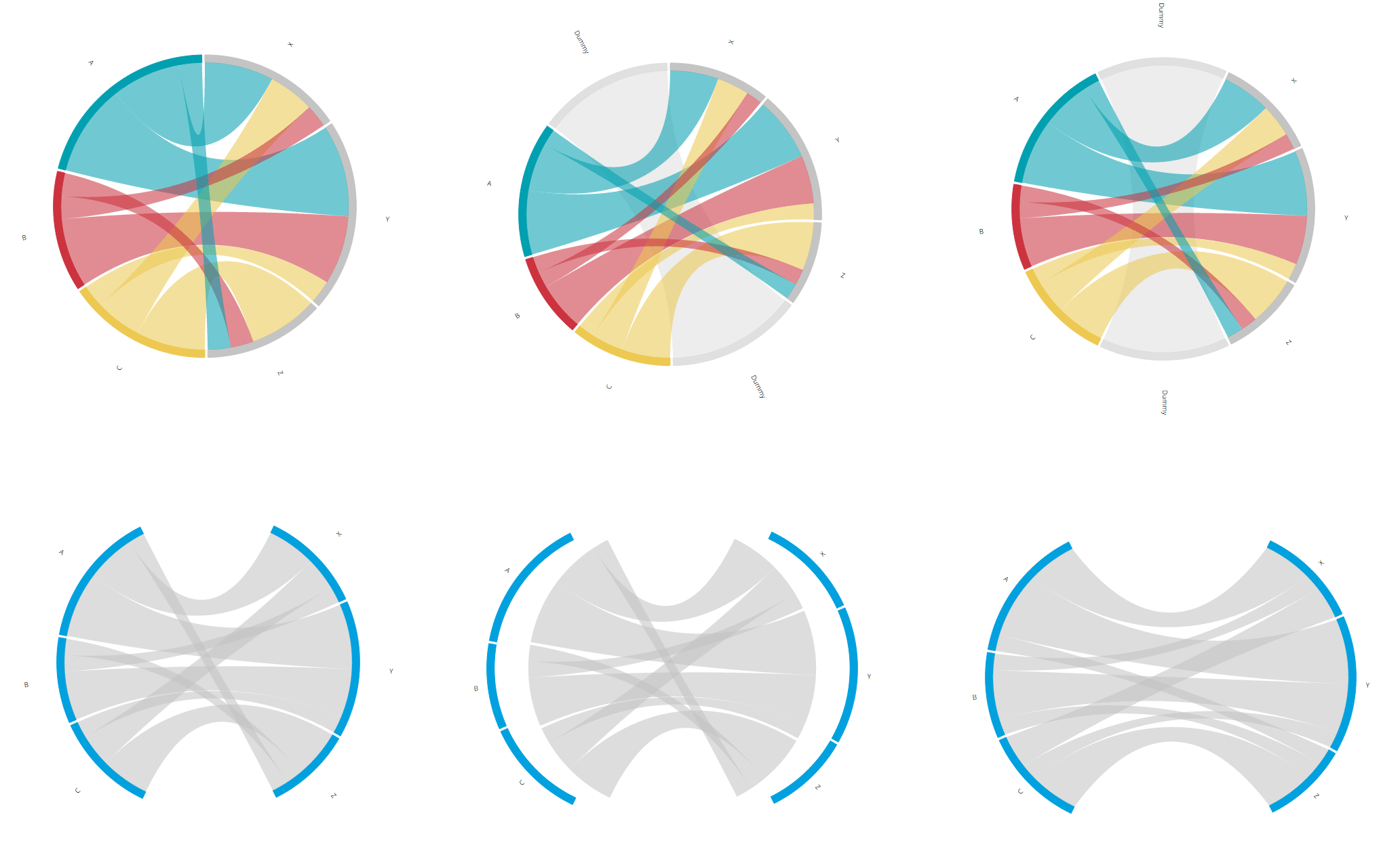
In the image below you can already see the steps that we are going to have to take to create the circular flow chart. There are about 6 steps and the next sections will try to thoroughly explain what is going on, how to shape your data and what you have to adjust to your code.
Step 1 - Set up a chord diagram matrix
If you are new to chord diagrams then perhaps check out this chord diagram explanation that I build a few months ago to get the gist.
A normal chord diagram’s input in terms of data is a matrix that shows how many (say, people) flowed from one region to another. What makes a chord diagram so special is that a flow from region A to B can be different than the flow from region B to A.
Say, we have educations A, B and C and the possible occupations are X, Y and Z. The first step was to figure out how to build the chord diagram matrix to make sure that the inner chords only connected a section from the left half (the educations) to a section from the right half (the occupations), like in the image below. I’ve colored the inner chords in the image so it becomes more clear that chords starting at A only go to X, Y or Z, and this is also true for chords starting at B and C. Apart from the restriction that chords can only connect two arcs from opposite halves of the circle, the image below is an ordinary chord diagram. No fancy things have been done to the standard options.
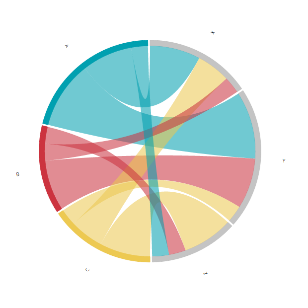
I first made a list of the flows. How many people should go from education A to occupation X, how many from A to Y and from A to Z. Next from B to X, Y and Z and finally the same for education C. These were just random numbers, the exact values didn’t matter
/* The randomly chosen flows from educations A, B & C to occupations X, Y & Z
//A → X: 15 | B → X: 5  | C → X: 10
//A → Y: 20 | B → Y: 15 | C → Y: 5
//A → Z: 5  | B → Z: 5  | C → Z: 15 */
Below you can see the matrix that results from the defined flows and gives you the image above. Right below it are four more images that are my attempt at an explanation of how the matrix is build up.
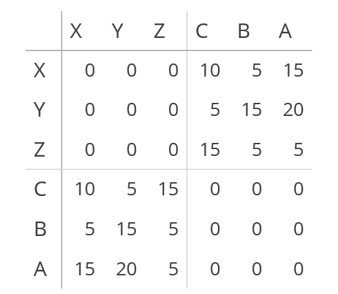
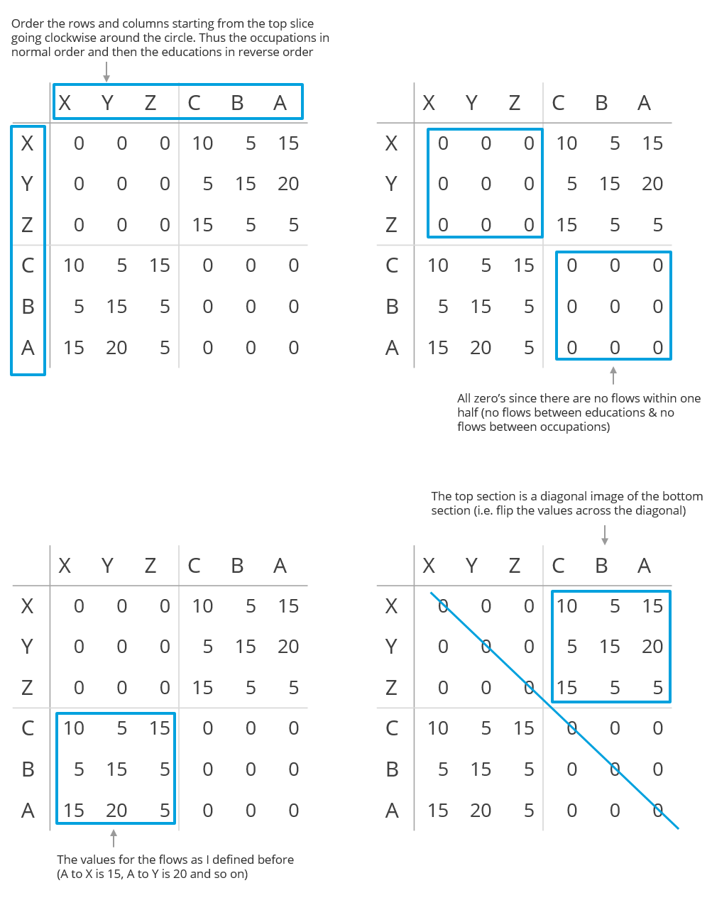
And for completeness, the table above would be written like this in JavaScript
var matrix = [
    [0,0,0,10,5,15], //X
    [0,0,0,5,15,20], //Y
    [0,0,0,15,5,5],  //Z
    [10,5,15,0,0,0], //C
    [5,15,5,0,0,0],  //B
    [15,20,5,0,0,0]  //A
];
Step 2 - Create an empty section in between the two halves
Alright, now we already have a flow diagram with circular halves, but it’s still difficult to see what the two groups are. Right now there is no difference in the distance between A and X (different group) and A and B (same group). Therefore, let’s create a bit of distance so the Gestalt law of Proximity makes the two groups intuitively visible.
We can make this distance by creating two new arcs right in between the two circle halves. These arcs will have exactly one chord (or flow) that runs between them. The thickness of this one chord will define how much of the rest of the circle remains for the other arcs. In the image below you see the desired end result where the extra dummy arc is added.
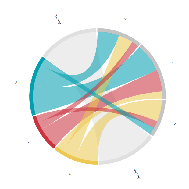
To do this, the matrix that we created in the previous step needs to be adjusted. Because we have two new arcs, the matrix will need two new rows and columns. One in between the occupations and educations (thus between Z and C) and one at the end (because the chord diagram is circular, this in essence means another one in between the other half, between A and X). The two arcs only have a flow in between themselves, so all entries in these new cells are zero except for the two locations that define the flow between the two dummy arcs.
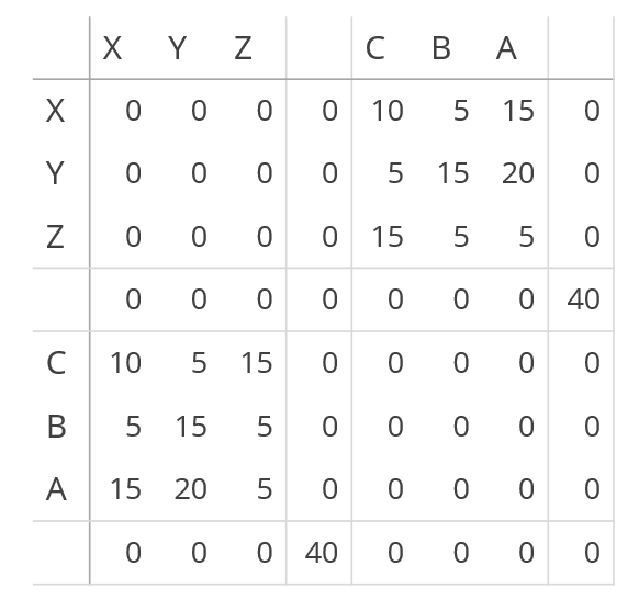
Below you can see an attempt at an explanation of what has been added. The number of 40 defines the width of the two dummy arcs relative to the other arcs. Making it bigger will result in less space left for the other arcs and making it smaller does the reverse.
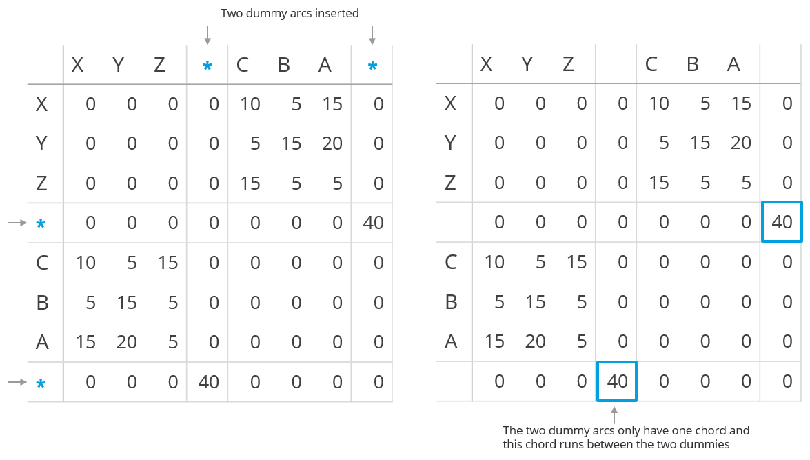
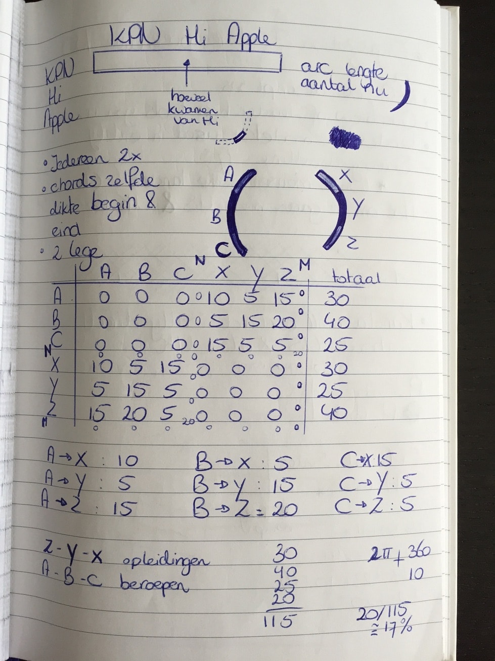
These two steps, first without and then with the dummy arcs, is exactly how I figured out how to do it. Just plain pen and paper still works best for me. The image below is the result of building the matrix for the first time (and the added extra dummy rows squished in between)
Step 3 - Make the two sections symmetrical
Now we have a dummy arc in between the two halves. We could make the dummy arcs and chord invisible. Then there would be two intuitively distinct groups. But the result wouldn’t be symmetrical, the X and A arc do not start/end at the same height and people do like symmetry. Therefore, we need to rotate the entire chord diagram so the two dummy arcs are centered horizontally. Again, the image below gives the end result that we want to achieve in this step.
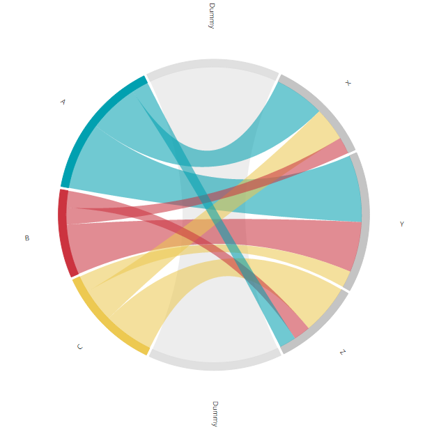
You might not expect it, but the rotation actually needs adjustments to quite a few different places in the code. There are three elements to the diagram: the arcs, the labels next to the arcs and the inner chords. All of these need to be rotated. Maybe you are wondering “Why not create a g group, put all of these elements in the g element and then only rotate the g?”. Well, the problem is that when I tried this, things go horribly wrong later on (image below) when we try to pull the pieces apart due to things like conflicting transforms. But that is not all, right now pulling the pieces apart means a translation across the horizontal axis. If we first do a rotation, in the new system of x and y, this has then become a combination of a translation in the making it very complex).
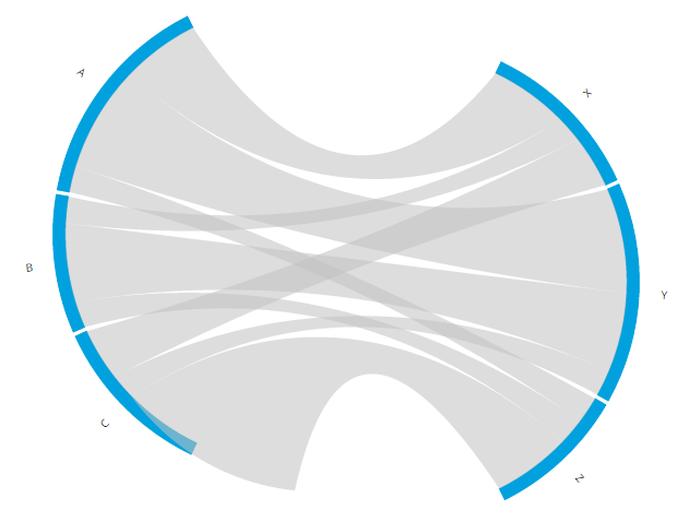
So, let’s do it a bit more complex right now to save ourselves a lot of headaches later on. We can make the arcs and chords rotate by using the startAngle and endAngle accessors of the d3.svg.arc() & d3.svg.chord() functions, which define the locations of the arcs and inner chords. Normally you do not define these functions when calling d3.svg.arc() & d3.svg.chord() because the default is fine. But we want to add an offset to this default. So, instead of
var arc = d3.svg.arc()
    .innerRadius(innerRadius)
    .outerRadius(outerRadius);

var path = d3.svg.chord()
    .radius(innerRadius);
We create two new functions that will define the new start and end angle of the chords and arcs and add these to the d3.svg.arc() & d3.svg.chord() accessors
//Include the offset in de start and end angle to
//rotate the chord diagram clockwise
function startAngle(d) { return d.startAngle + offset; }
function endAngle(d) { return d.endAngle + offset; }

//startAngle and endAngle now include the offset in degrees
var arc = d3.svg.arc()
    .innerRadius(innerRadius)
    .outerRadius(outerRadius)
    .startAngle(startAngle)
    .endAngle(endAngle);

var path = d3.svg.chord()
    .radius(innerRadius)
    .startAngle(startAngle)
    .endAngle(endAngle);
To make things easy for us, we can calculate the offset to make sure that the dummy arcs are exactly in the center. Furthermore, it would probably also be easier if we can define the widths of the dummy arcs in a percentage compared to the visible arcs. Below you can see the code that does both of these two things
//Total number of respondents (i.e. the number that makes up the group)
var respondents = 95;
//What % of the circle should become empty in comparison to the visible arcs
var emptyPerc = 0.4;
//How many "units" would define this empty percentage
var emptyStroke = Math.round(respondents * emptyPerc);

var matrix = [
    [0,0,0,0,10,5,15,0], //Z
    [0,0,0,0,5,15,20,0], //Y
    [0,0,0,0,15,5,5,0], //X
    [0,0,0,0,0,0,0,emptyStroke], //Dummy stroke
    [10,5,15,0,0,0,0,0], //C
    [5,15,5,0,0,0,0,0], //B
    [15,20,5,0,0,0,0,0], //A
    [0,0,0,emptyStroke,0,0,0,0] //Dummy stroke
];

//Calculate how far the chord diagram needs to be rotated clockwise
//to make the dummy invisible chord center vertically
var offset = Math.PI * (emptyStroke/(respondents + emptyStroke)) / 2;
The new variable respondents gives the result that we get when summing all of the values in the lower left block (or upper right block). It’s the size of A, B and C together (and thus also X, Y and Z together). Next we define what percentage we want to be empty relative to respondents with the emptyPerc variable. In emptyStroke this percentage is translated to the number of units (nonexisting people) that is needed to create an arc of that width. We can then replace emptyStroke in the two locations where we previously hard coded the 40 value.
That was part one, we can now define the width of the dummy arc in a percentage. Next up is calculating the offset which happens in just one line. We need to rotate the full chord diagram by half of the arc length of a dummy arc. By rotating it by half an arc, the two dummy arcs will end up right in the middle. Mathematically this results in the following formula:
offset = (0.5 * emptyStroke) / (2 * (emptyStroke + respondents)) * 2πLet me explain in steps. A full circle consists of the two dummy arcs, sized by emptyStroke, and the two halves of education and occupation (which are the same size by design). So a full circle represents 2 * (emptyStroke + respondents) units. We want to rotate this by half of a dummy arc, which is 0.5 * emptyStroke. We can turn this into a percentage; what percentage of a full circle should the diagram be rotated:
percentage_of_rotation = (0.5 * emptyStroke) / (2 * (emptyStroke + respondents))The start and end angles use radians and a full circle is 2π radians, thus we need to multiply the percentage by 2π to convert it to radians. Cleaning up the formula a bit we end up with
offset = π * emptyStroke / (emptyStroke + respondents) / 2This is the variable that is called in the new startAngle and endAngle functions. However, we’re still not done. We also need to rotate the labels along with the arcs. Luckily, this is easily done. We only need to add the offset variable to the .each function that calculates the text angle in the call that creates the labels:
//The text needs to be rotated with the offset in the clockwise direction
g.append("text")
    //Slightly altered function where the offset is added to the angle
    .each(function(d) { d.angle = ((d.startAngle + d.endAngle) / 2) + offset;})
    .attr("dy", ".35em")
    .attr("class", "titles")
    .attr("text-anchor", function(d) {
        return d.angle > Math.PI ? "end" : null;
    })
    .attr("transform", function(d,i) {
        var c = arc.centroid(d);
        return "rotate(" + (d.angle * 180 / Math.PI - 90) + ")"
        + "translate(" + (innerRadius + 55) + ")"
        + (d.angle > Math.PI ? "rotate(180)" : "")
    })
    .text(function(d,i) { return Names[i]; });
And that was it for the rotation. We can now clean things up and make the dummy arcs truly disappear (make the opacities equal to 0 and/or fills to white). I altered the colors to make it closer to the very first example at the top of the page. Without the dummy arcs visible it is much more apparent that we have two separate groups and that the chords run between these two groups.
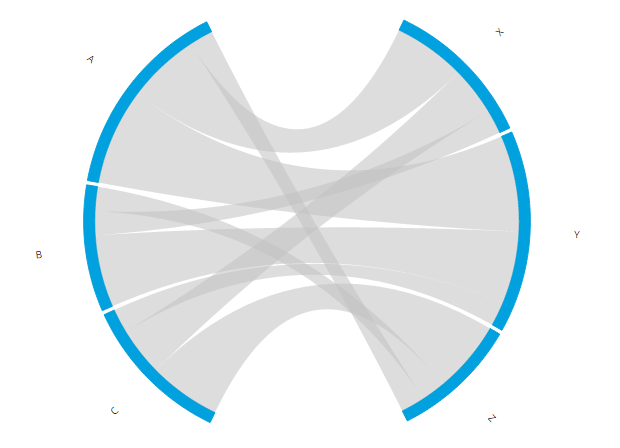
Step 4 - Pull the two halves apart
Now we’ve gotten to the section where we have to do something that I really wasn’t sure that I actually could. The image above already shows what could be an end result. The chord diagram shows a flow between two groups. But I felt it just didn’t look right. The entire image still fits inside one circle and the chords are too short. Not very good arguments, I know, but I felt it could look better if the two halves could be pulled apart. That involved quite a lot of math as well, but it translated itself into a lot more complex code adjustments than the previous section. But no worries, I wrapped the most complex part in a nice new function that you can download and use.
I’ll split this up into two steps. First we’ll move the arcs and labels apart. These pieces only need to be displaced horizontally, they do not need to be adjusted in width or height. The image below again shows what we will end up with after this first step.
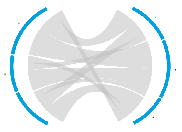
We need to a new variable and apply a transform to both the arcs and the text elements. Let’s call this new variable is pullOutSize. It defines how many pixels the left side will be moved even further to the left and how many pixels the right side will be moved further to the right. Thus the total distance that is created between the two pieces is twice the pullOutSize.
//How many pixels should the slices be pulled from the center
var pullOutSize = 50;
Next, we have to add a transform to the arcs that will translate all the arcs in the desired direction. As you can see in the code below, it’s just one addition to the standard code to create an arc. For the arcs on the right side, the variable pullOutSize needs to a positive number, but for the left side pullOutSize needs to be a negative number. Therefore there is a small if/else statement that looks if the starting angle of an arc is already past half of the circle (which equals to π radians) and then applies the right sign to pullOutSize. For convenience I save the value of pullOutSize (with correct sign, positive or negative) in the data itself.
//Add the transform step to pull the arcs away from the center
svg.append("g").selectAll("path")
    .data(chord.groups)
    .enter().append("path")
    .style("fill", function(d) { return fill(d.index); })
    .style("stroke", function(d) { return fill(d.index); })
    .attr("d", arc)
    .attr("transform", function(d, i) {
        //The pullOutSize should be added to the arcs on the right and
        //subtracted from the arcs on the left
        //Therefore check of the starting angle is larger than half of
        //a circle to figure out when to flip between these two options
        //Save the pullOutSize in the data so it can be use again for
        //the text in a following step
        //The 0.01 is for rounding errors
        d.pullOutSize = pullOutSize * ( d.startAngle + 0.01 > Math.PI ? -1 : 1);
        return "translate(" + d.pullOutSize + ',' + 0 + ")";
    });
And now the text. This section already includes a transform step so we need to be careful on how to add the new translation without messing with the other transform steps. The original code first rotates the text and then moves the text outward (which then happens along a radial outward from the circle because of the rotation that was performed first) and finally flips the text if it is located on the left side of the circle.
I found that this had to change to get the result that I was after. I first had to place the text at the location where the original arc is located, then translate it further to the right/left, then rotate and finally flip it if it is on the left side. Thankfully, the d3.svg.arc() has a very useful option. You can request where the location is of the center of an arc with the .centroid() function. What this function returns is the x and y location. Very useful since I only need to add (or subtract) pullOutSize from the x location. Next, I rotate the text as in the original first transform step. Because the text is already located at the arc, we do not need to push it very far out, so the third step is no longer innerRadius + 55, but only 55. Finally we do still need to flip the text on the left side of the circle.
/*
//This is the original Chord Diagram code to create the labels along the arcs
//Already including the "offset" in the .each function
svg.append("text")
    .each(function(d) { d.angle = (d.startAngle + d.endAngle) / 2 + offset; })
    .attr("dy", ".35em")
    .style("text-anchor", function(d) {
        return d.angle > Math.PI ? "end" : null;
    })
    .attr("transform", function(d) {
        return "rotate(" + (d.angle * 180 / Math.PI - 90) + ")"
        + "translate(" + (innerRadius + 55) + ")"
        + (d.angle > Math.PI ? "rotate(180)" : "");
    })
    .text(function(d,i) { return Names[i]; });
*/

//Next to the offset already present, change the transform step to incorporate
//the pulling apart of the two halves of the circle
svg.append("text")
    .each(function(d) { d.angle = ((d.startAngle + d.endAngle) / 2) + offset;})
    .attr("dy", ".35em")
    .attr("text-anchor", function(d) {
        return d.angle > Math.PI ? "end" : null;
    })
    .attr("transform", function(d,i) {
        //Where does the center of the arc fall
        var c = arc.centroid(d);
        //First move the arc pullOutSize away from the original location
        //along a horizontal line
        return "translate(" + (c[0] + d.pullOutSize) + "," + c[1] + ")"
        //Still the same
        + "rotate(" + (d.angle * 180 / Math.PI - 90) + ")"
        //Changed because of the first translate already applied.
        //How far should the label be placed away from the arc itself
        + "translate(" + 55 + ",0)"
        //Still the same
        + (d.angle > Math.PI ? "rotate(180)" : "")
    })
    .text(function(d,i) { return Names[i]; });
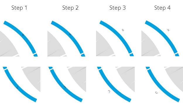
Below you can see what each transform step does to the text. Step 1 is the result by applying only the first line of the transform step translate(" + (c[0] + d.pullOutSize) + "," + c[1] + "). Step 2 is the result of applying the first and second line, and so on. I hope this makes the code easier to understand.
Step 5 - Make the chords touch the pulled apart arcs
Now we’re almost there. Just need to fix those chords… The problem is that the chords need to be drawn differently, not transformed. I knew that I had to dive into the d3.svg.chord() function itself for this. There was no useful function, such as the .centroid() before, that could help me out (at least, not that I could find). This was the first time that I really went into the d3.js code. First I pulled all of the essential d3.svg.chord() lines from the complete library and then tried to understand exactly what each piece was doing, what its result was.
I truly surprised myself when I had made the adjustment, refreshed and saw that it all worked (ノ◕ヮ◕)ノ*:・゚✧ I was giddy the rest of the day
Below you can see a screenshot where I was figuring the code out. I had placed different colored dots in the corners of one chord so I understood how each of these dots would have to change to pull them apart. Let me spare you the details of how I finally managed to actually make it work. All I can say is that I learned a lot about the workings of SVG paths (M’s, Q’s, A’s and Z’s) thanks to this excellent tutorial that I have forgotten now that we’re a few weeks further.
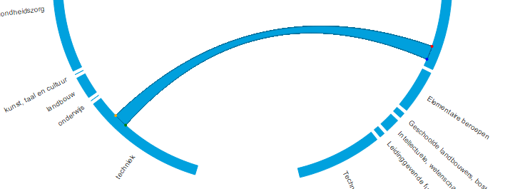
The upside is that all you have to do to get the chords to be drawn in a stretched form is download the new d3.stretched.chord.js function and then replace d3.svg.chord() in your path variable with stretchedChord(). You also supply the variable that contains the pull out (I’ve used pullOutSize throughout) to the .pullOutSize() option. Yup, that’s all. Strange, how all the previous steps were changes throughout the script and then the most difficult of all could be caught off in a new function for which you need to adjust one line (and load the script of course).
//replaced d3.svg.chord() with the custom chord function
var path = stretchedChord()
    .radius(innerRadius)
    .startAngle(startAngle)
    .endAngle(endAngle)
    //supply the variable that contains the pull out amount
    .pullOutSize(pullOutSize);
By changing the pullOutSize variable you can stretch or squeeze the left and right halves as far as you like.
Pulling the pieces apart took quite some time, but when I compare the non-stretched version with the stretched one I really do like it a lot better when the two halves are further apart instead of forming a perfect circle.
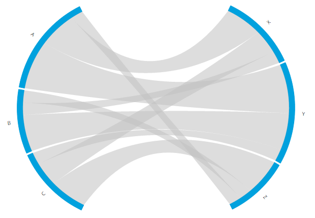
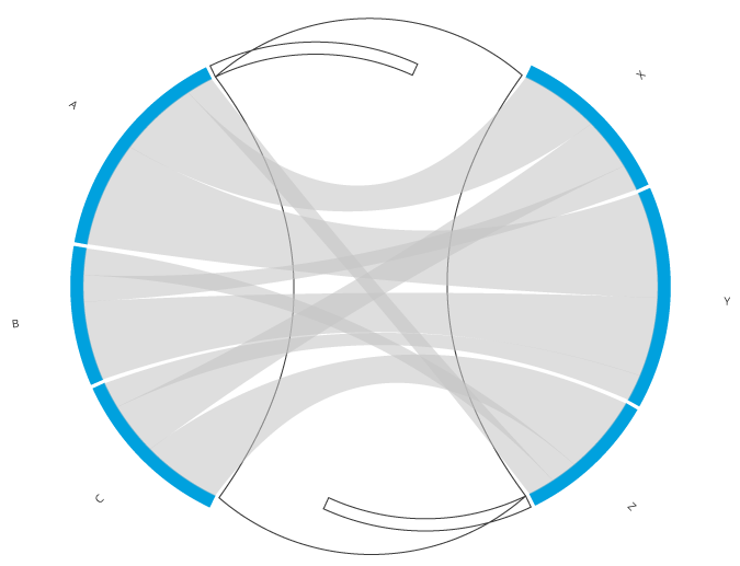
For the few who might be wondering what happened with the two dummy arcs and the chord that connected them after all those transformations I created the image below. As you can see, they are still there, but it’s a good thing that they are invisible.
Step 6 - Apply a more visually appealing sorting
One final tiny adjustment. Right now the chords get sorted from thickest to thinnest chord along an arc. But it would be better to just leave them be, so that the first chord of A flows to X, the middle one of A goes to Y and the bottom one of A goes to Z to remove the number of overlaps. Just removing the .sortSubgroups(d3.descending) line from the d3.layout.chord() function sadly does the reverse. The top chord of A goes to Z and the bottom goes to X, resulting in a lot of overlap. I tried to use the option to apply a custom sort function to the chords with sortSubgroups(). However, you can only use the values of the chords themselves, not the indices of the chords. Therefore, to get what I wanted, I again had to dive into the d3.js source code, take out the complete d3.layout.chord() function and literally add 10 characters, namely a .reverse(), and remove the .sortSubgroups() line in the front-end to make it work. In case you want to use it as well, you can download the adjusted d3.layout.chord.sort.js and make the following adjustment to your code:
//Call the custom layout function instead of d3.layout.chord()
var chord = customChordLayout()
    .padding(.02)
    .sortChords(d3.descending)
    .matrix(matrix);
/*Note that you no longer call .sortSubgroups(d3.descending),
this would mess the sorting up again*/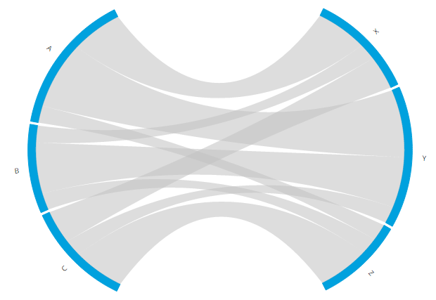
Code for all intermediate steps
Here you can find the code for the end result. For those who really want to see the code for all the steps instead of just the last one I’ve uploaded each of them as well
- The Final Result - Including the hover effects
- Step 1 - How to set up a Chord Diagram matrix to show Flows between the left and right half
- Step 2 - How to create an empty section in between the two halves
- Step 3 - How to make the two sections symmetrical
- Step 3 - The new blue/grey color scheme
- Step 4 - How to pull the two halves apart
- Step 5 - How to make the chords touch the pulled apart arcs again
That was quite a long tutorial and I am far from sure that anybody else ever wants to create a circular flow chart (or batplot (⌐■_■) ). But in case there is somebody, I hope the steps above will help you in creating it!