I often get emails from people asking me diverse question about my path into data visualization. And after typing out my story for the Nth time I thought it might actually be easier if I just place it in a blog post. That way I can be more detailed & even add some images (ノ◕ヮ◕)ノ*:・゚✧
TL;DR From Astronomer to Data Scientist (during which I learned R) to self taught Data Visualization Designer. Mostly by creating tons and tons of data visualizations. Many also in my free time to learn the web languages and D3. Reading books about best practices, getting involved online in the dataviz community and presenting about my love for the topic at conferences and meetups. Now a full time data visualization freelancer who’s very much enjoying her work.
But for the whole shebang with all the details, never before seen images of charts I made years ago and more, read on…
2005 - 2011 | Starting out as an Astronomer
I did get into simple HTML & CSS a few years before starting Astronomy. Designing a pet page on Neopets, but that was mostly forgotten by then
After high school I went to Leiden University to study Astronomy. Combining an interest I had for the field with my enthusiasm for math and physics. In my first year I had to do a course on C++, my first introduction to programming. I truly liked the challenge of creating something by typing out variables, loops and if-else statements that could then do stuff. Like figuring out the day of the week on which you were born after supplying a birth date. But although I truly enjoyed the class (maybe not specifically the C++ language), I didn’t do any more programming for 3 whole years.

In my final Bachelor year it was time for the Bachelor thesis, my first true research. As a preparation, the whole 3rd year got an introduction to IDL, the programming language that is/was often used in Astronomy …and nowhere else (ー_ー﹡; ) … IDL, I found out much later, is similar to R and I took a liking to it, much better to handle than C++. In the next half year (and the following two years of Astronomy Masters, where I chose the theoretical route), I started to use IDL more and more. For my Master’s thesis I was even programming the entire day, analyzing results from simulations. I also learned a bit of SQL because I needed it to get the right data from the simulation database. But don’t get me wrong, this didn’t turn me into some development pro, IDL is “just” a data analysis tool. I wasn’t creating apps or tools, I was just writing a script that would analyze my data and spit out an image or some numbers (like how I use R these days).
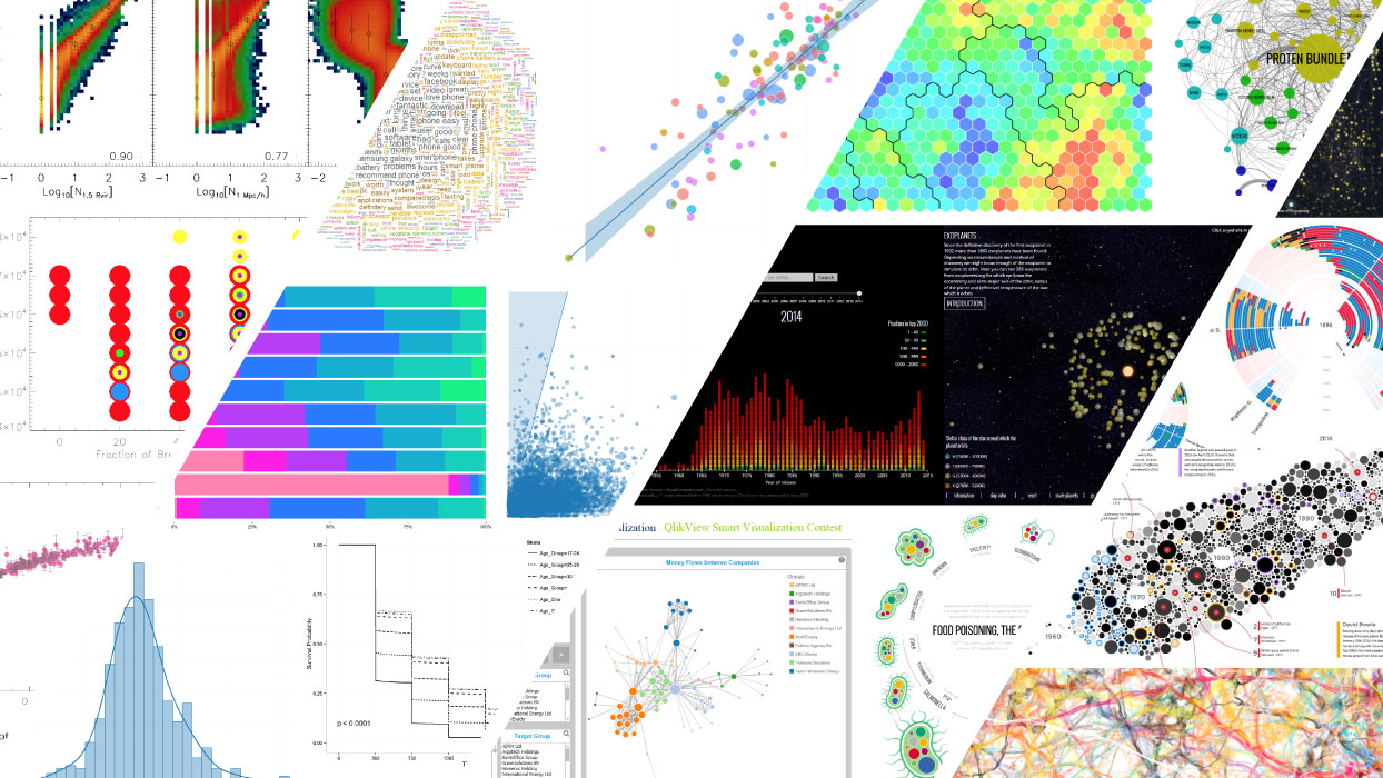
I’ve managed to find the 3 “official” Bachelor and Master research papers that I had to write. Above an below are some of the images from those. I can’t remember exactly, but I think that the circles on the right in the top image and the two scatterplots on the right in the bottom image were “thought up” by me, while for the others I was using the “standard” way to display that particular data.

2012 | Becoming a Consultant & Data Scientist
I knew doing a full PhD wasn’t for me. Although I liked doing the research, I truly hated writing the papers. I also wanted to work on something more tangible, more diverse and something where more than 3 other people in the world understood what I was doing. So I started looking for a job and found a great match at Deloitte Consulting where they were just setting up an analytics team within their Business Intelligence department.
At Deloitte, I was still analyzing large amounts of data, but now it was about people, or what they bought, or their mortgages; things closer to home. Since I couldn’t use IDL anymore, I had to learn something new to analyze the data with. And in my first year at Deloitte I learned about 6 different languages. Mostly because I had to use whatever the client needed, such as QlikView’s own version of SQL, SAS (not my favorite), VBA (even worse), and then came R.
And R, combined with RStudio, was right up my ally. It had the same mindset as IDL. You could run the program line by line without having to “compile” the whole script and run it completely every time. Running line by line makes it very easy to debug I find, or understand somebody elses function. And R is truly meant as a data analysis tool. It has packages to help you in practically anything, from general data preparation, text mining, plotting (using ggplot2) to more obscure things such as calculating the large-arc distance between two locations on Earth or an API to Google trends.

You just need stackOverflow a lot or go through ggplot’s online documentation to find how to script something specific in ggplot.
It took some time to get the hang of ggplot2’s “chaining” idea, in which you sort-of stack together different options that define the look of the chart. But in retrospect it makes a lot of sense now and it gives you quite a lot of possibilities. Another nice aspect is that you can save the resulting chart as a PDF to load into Illustrator for some final adjustments. However, I only started doing that, occasionally, 3 years later.
Above and below you can see some of the charts I made in R during my first year. These are charts that I deemed “worthy enough” to actually save on my private computer. I made hundreds of super simple and ugly plots that I never kept. Bars, lines, scatters. All to get a better sense of the data and realize what kind of chart works for what kind of data and goal.

2013 | Realizing d3.js exists
In February of 2013 I went to a (data science focused) Strata conference in the Bay Area. There I joined an introduction to d3 session. I had never heard of it before, but I was immediately hooked! After getting back home I spend the next week trying to build my own interactive scatterplot that could switch between different variables and do some animations on mouse hovers. Yes, it took me a whole week of free hours to set it up from scratch! That was because JavaScript was completely new to me, and I had only minimal knowledge of HTML and CSS. Figuring out d3’s chaining and enter+update+exit way of thinking was another added hurdle (I think it took me at least a year before I truly understood it). It was a steep learning curve, but I was overly enthusiastic by the possibilities of d3 and, even though it took a long time, I was making small improvements every now and then.
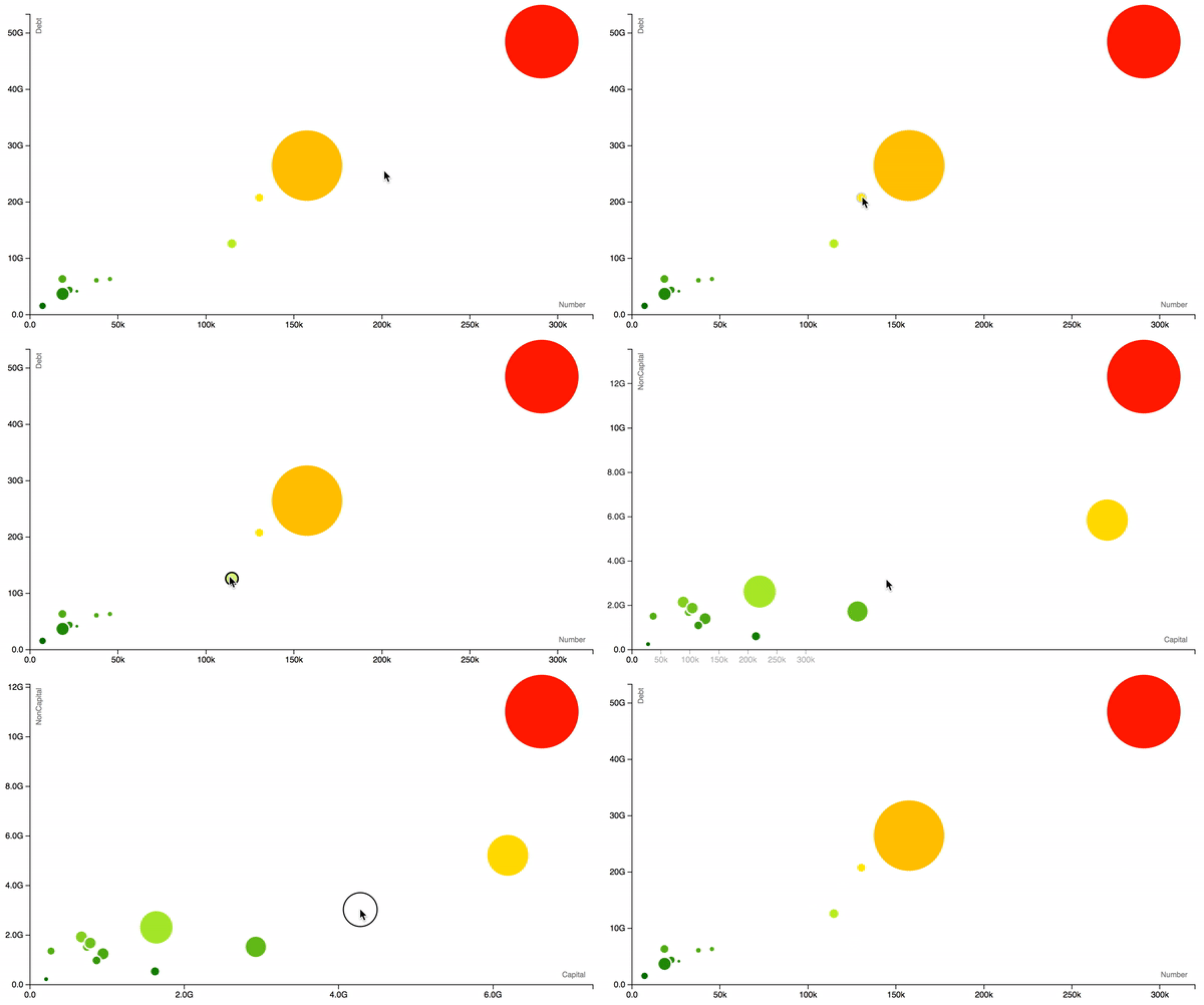
Usually I find my examples on bl.ocks.org, which is an awesome, awesome place. Especially if you visit it through blockbuilder.org where you can search blocks and code right there in the browser!
After that ordeal I learned to try and start from an existing example and adjust it to work with my data. Just getting my own data in the visual could already be tricky enough sometimes. I could be stuck on the simplest of things, because I didn’t know where a certain error came from. Realizing that nested arrays of objects in JavaScript remain linked if you copy them into a new variable… mind-blown (●__●)
In the next year I didn’t do d3 that often actually. I still had too much to learn to quickly be able to whip something up during work. No, then R graphs were faster still.
I even found an online & still working demo of the QlikView-d3 based network! !
Another tool that was used heavily by the BI side of my department was QlikView; a program to create interactive dashboards. You can also load your own JavaScript based visualizations as extensions into the tool. In the spring of 2013, QlikView held a competition for the best extension and me and two colleagues thought it would be fun to enter. I suggested to use d3; to take a chart form from d3 and make it available within the QlikView environment. I’ll spare you the details, but it turned out to be quite a challenge to have the d3 network chart work under all of QlikView’s options (I also made a draggable globe which didn’t make it to the finals.) Sadly, we came in second with just 3 votes too few, but it did give me a boost in my d3 knowledge.

2014 | Discovering my passion
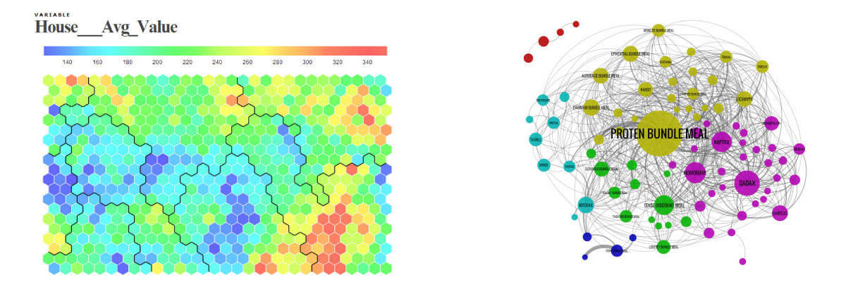
Zipping forward to November 2014. In the meantime I had created a few more d3 based visuals during work on longer projects, where I could scrape together enough time to build it (or adjust it from something else I liked). Such as a hexagonal heatmap to use for a Self Organizing Map algorithm that I often applied on client projects. And a network to visualize connections between items that people often bought together; the result of doing an association analysis (the visual is mostly based on the work by Raphaël Velt). But I still saw myself as a data scientist. The only problem was, I wasn’t sure I was still enjoying it as much as I used to. Getting that predictive model to become 1% more accurate left me with more frustration than elation.
But in November 2014 I visited another Strata conference, in Barcelona. I still remember feeling a bit empty, not really knowing what I wanted to focus on in the coming year. And then I went to a presentation by Mike Freeman. On his title slide it said Data Visualization Specialist. And it was as if I’d been hit by lighting. that’s a thing on its own?! You can specialize in data visualization?!". In that instant I knew I wanted to be able to call myself that some day. I had regained my enthusiasm and passion. And the fact that Mike gave a great talk about using storytelling to convey complex data and insights probably helped as well :)
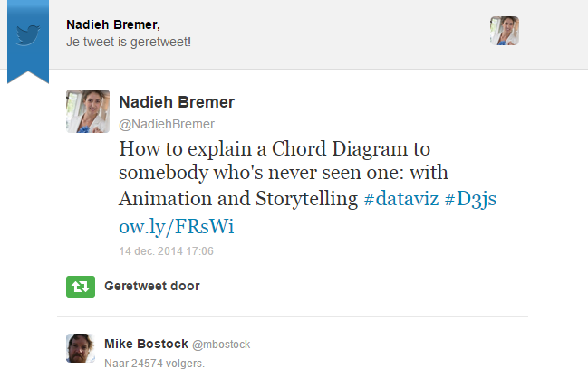
In the next month I spent all of my free time, evenings & weekends, on turning the most complex chart I’d ever made for Deloitte, a chord diagram about phone brand switching, into a storytelling based visualization. Slowly explaining how to interpret the insights from the chart. I sent it to Mike Freeman to ask his opinion and he was so super nice and enthusiastic about it! He sent out a raving tweet that was even picked up by Mike Bostock, the creator of d3 (I still have the screenshot of the notification of him retweeting my visual and I was literally jumping in my room then).
It gave me such a boost that I started reading tons of books about best practices, but even more importantly, I created more personal projects; about the top 2000 songs, about exoplanets, about our solar system. All in my own time of course, but that didn’t matter, it had become my hobby. I was truly enjoying myself.

2015 | Becoming a Data Visualization Designer
At work I had a long talk with my mentor and my boss about wanting to specialize in data visualization. Luckily, they were very supportive. They’d tell all the other managers in case they came across a project that needed some proper dataviz. Of course there wasn’t always work to do in data visualization, so I still did my fair share of data analyses and such, but as the year went on I was involved in a fair a number of fun projects (e.g. State of the State), often involving d3 to create an interactive result of the client’s data.
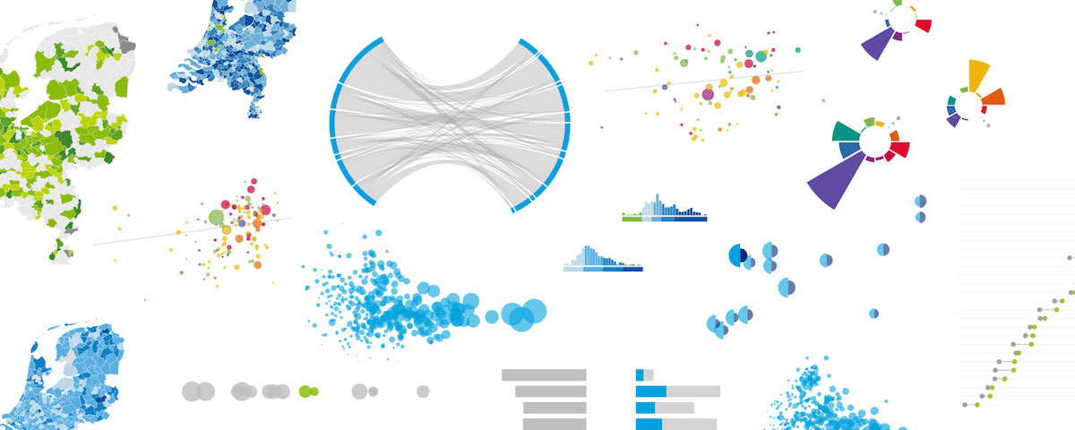
In my free time I continued to learn by creating personal projects. But another important facet was my blog. I had created something simple on blogger in 2014 where I had shared a few things, but it wasn’t anything substantial. Until now! I thought of the name Visual Cinnamon, started adding posts about my personal projects, talking about the challenges, bloopers, and the final result. I created tutorials about very specific (often d3 related) elements that I’d learned and hoped other people could use as well. In March of 2015 I even moved from a free blogger site to a hosted Wordpress one. This gave me the opportunity to create more pages, such as a portfolio and pages where I listed my favorite dataviz resources for learning the trade.

There are also reasons for not entering a competition; maybe the company wants a lot to choose from for virtually no money, so be careful
I also entered two competitions. It’s a good way to get some pretty clean data and a topic to visualize. It’s something to add to your portfolio and you can see how you stack up against others. The first became a static visual about food poisoning for Information is Beautiful (sadly that was the last challenge they did), and the second turned into an interactive about Urbanization is East Asia for Visualizing.org & the World Bank.

2016 | Getting hired as a Data Visualization Designer
In December of 2015 I decided, for reasons mostly outside of dataviz, to switch jobs and join Adyen as a full time Data Visualization Designer. They approached me for a data analysis role, but I told them I was only interested in switching if I could focus on data visualization (for a large part). They looked at my website and thankfully liked what was there, because they said I could join for data visualization as well. So all that time spend on keeping my website up to date paid off! They were already using d3 for their client dashboards and wanted to revamp them.
Most of my time at Adyen I spend on either creating updates of old dashboards, or creating new ones. Interviewing eventual users about their needs, understanding what data was available, making (rough) designs and sometimes building them into Adyen’s environment (2-3 front end colleagues build many of my dashboard designs as well).

It was here that I came to understand that I’m more of a prototyper. I didn’t know nearly enough about web development to be (even closely) on par with my front-end colleagues, but in terms of data visualization specifically I could suddenly dream up and build standalone examples that they had no idea how to create. So after a few months I took my hands off actually building things into Adyen’s environment and focused on designing and prototyping new ideas.
2016 | Getting more involved with others
I definitely never expected at the start of 2016 that flying around the world to speak at conferences would become part of my life by the end of 2016
In my personal time 2016 became the year in which I learned I actually liked presenting about my love for data visualization (still horribly nerve wracking though (◍•﹏•) ). OpenVis in April was my first international conference, but by the end of 2016 I was flying back from speaking at CSSConf in Melbourne! For both of these conferences I applied in the general call for speakers, but I think (not sure) that my blog with projects and, even more importantly, tutorials helped convince the OpenVis committee to give me chance. Nevertheless, having a good idea is the most important thing of course, even if you have no blog. Some calls for speakers are actually completely anonymous; they really choose based on the idea, not the person. A great way in for a newbie.

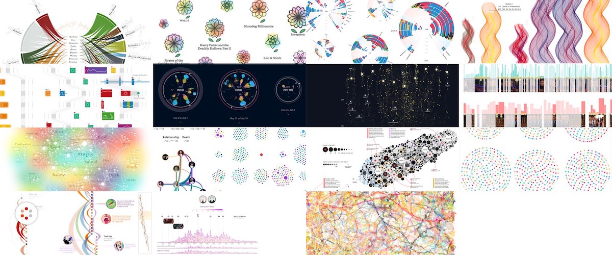
In 2016 I also started my collaboration with Shirley Wu, a great data visualization designer from San Francisco, called Data Sketches, in which we create an extensive data visualization about the same topic each month and write about the process of data gathering, preparing, sketching ideas and coding it into reality. We’re in our 9th month as I’m writing this and I’ve learned tons and tons more since starting in July 2016, both on a technical and creative front. There’s just nothing that beats actually doing projects if you want to learn data visualization.
2017 | Going into freelance
After a year of primarily creating dashboards at Adyen I figured out that I was missing the diversity that I had as a consultant. Every few weeks a completely different client, in a different industry, with different data and different problems. I therefore decided to do something that had been rumbling in the back on my mind for at least a year by then, I started as a freelancer in data visualization in January of 2017.
However, because I still had things I wanted to explore at Adyen, and because I wasn’t sure there was a good enough market for the kind of “creative” data visualizations that I wanted to work on, I started out part-time; 3 days with Adyen and the remaining 2 as a freelancer. Thankfully, things worked out really well, and after 6 months I’d gotten enough work to start freelancing full-time and therefore quit my job at Adyen.
And I’m really happy that I decided to become a freelancer! I’m having fun, my work has diversified again, I get to work with people and companies that I’d only dreamed about, although the administration is an (expected) pain. I hope I’ll continue to enjoy myself as much as I am right now for many years to come!
Wrapping up
Well, that was a rather lengthy account of my windy path into data visualization. How and when I learned the tools to create visuals together with some (embarrassing) charts from each period. And the opportunities that I said yes to, even if they seemed scary or time consuming. I hope my story might give you an idea about how you can become more specialized or involved in the field of data visualization as well, if that is what you want. Or maybe it’s just nice to know how somebody else wandered around, that it wasn’t a clear path for me and that it took effort and passion, something everybody can muster, to get to a point where my main job is doing dataviz.