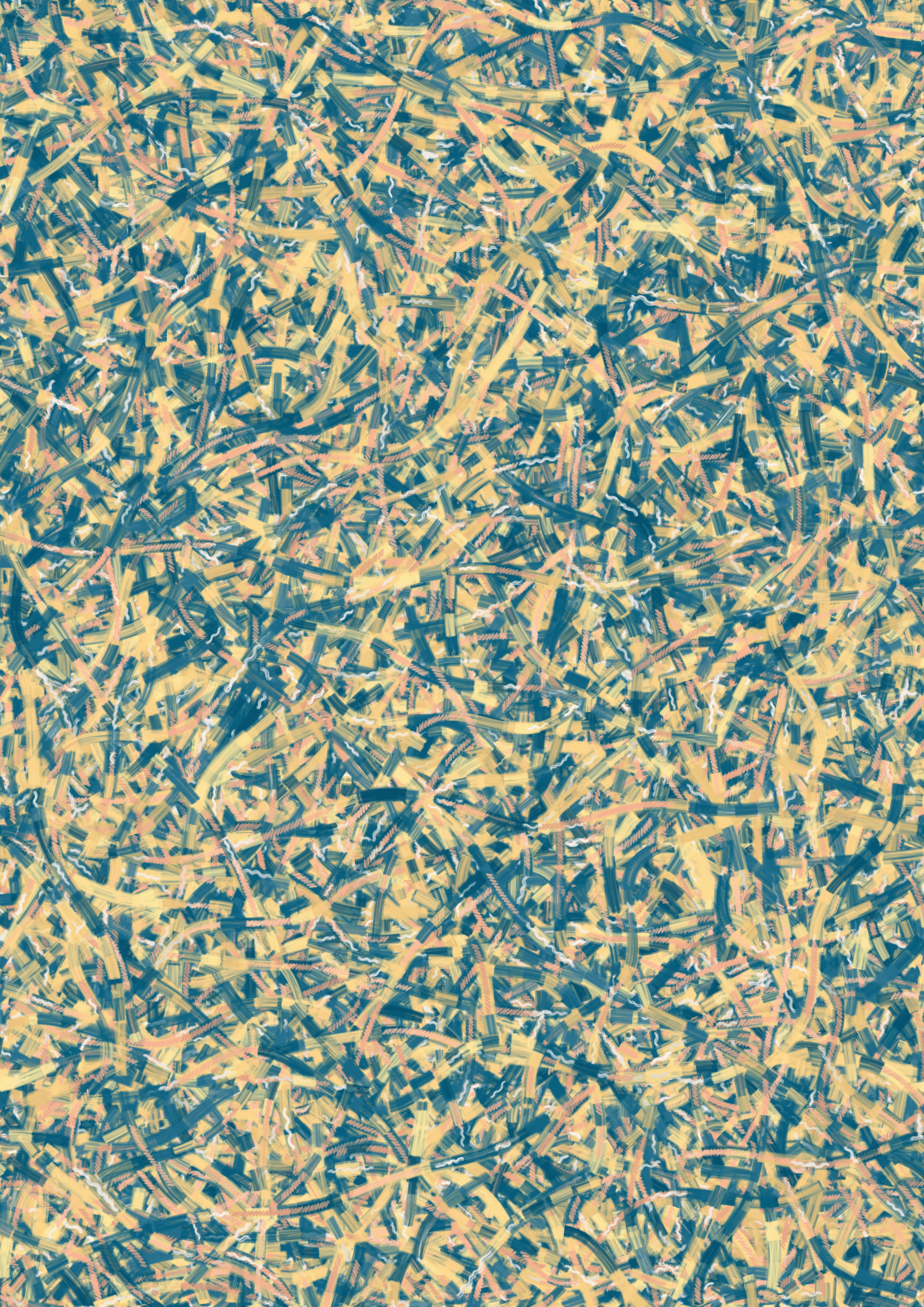
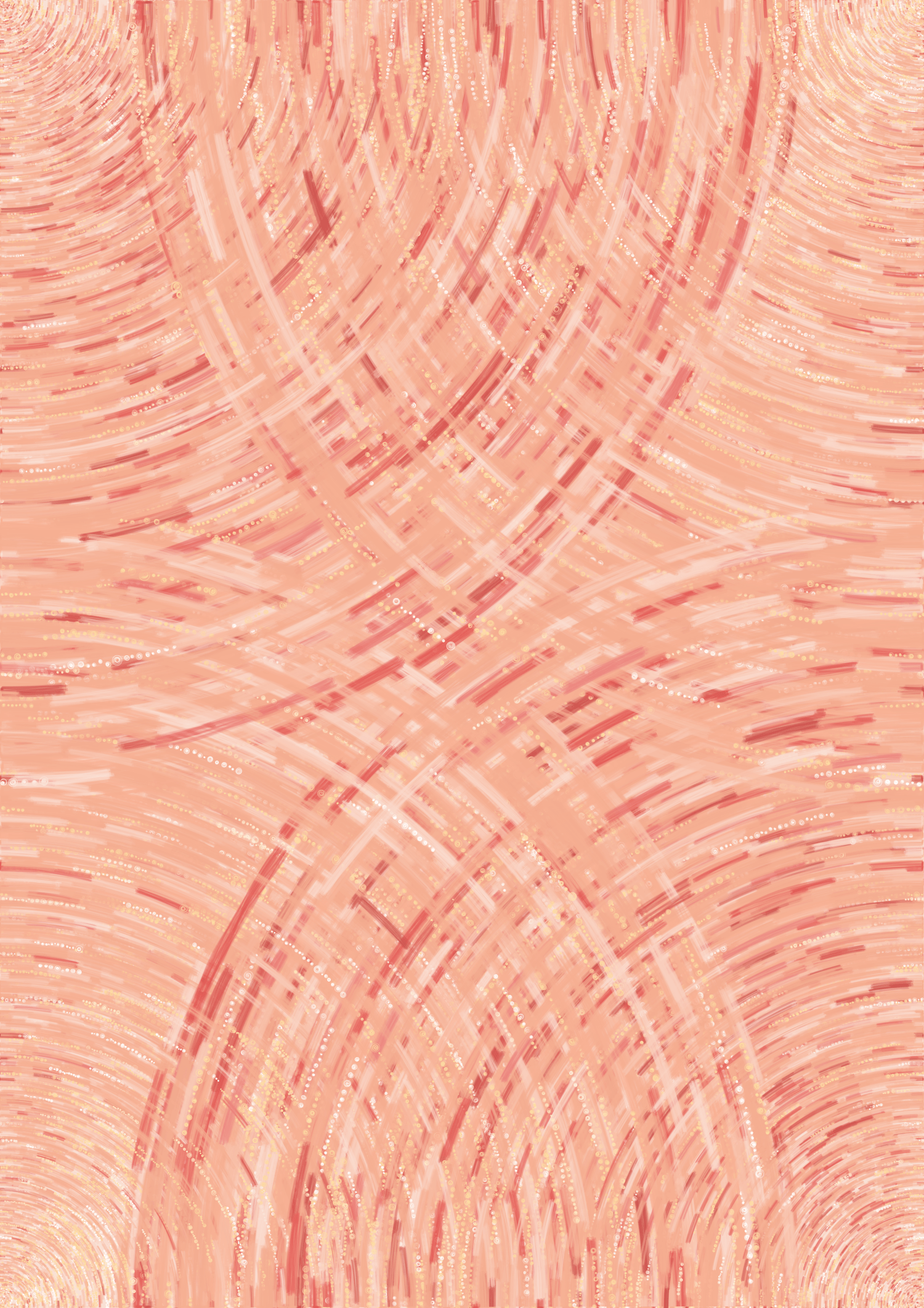
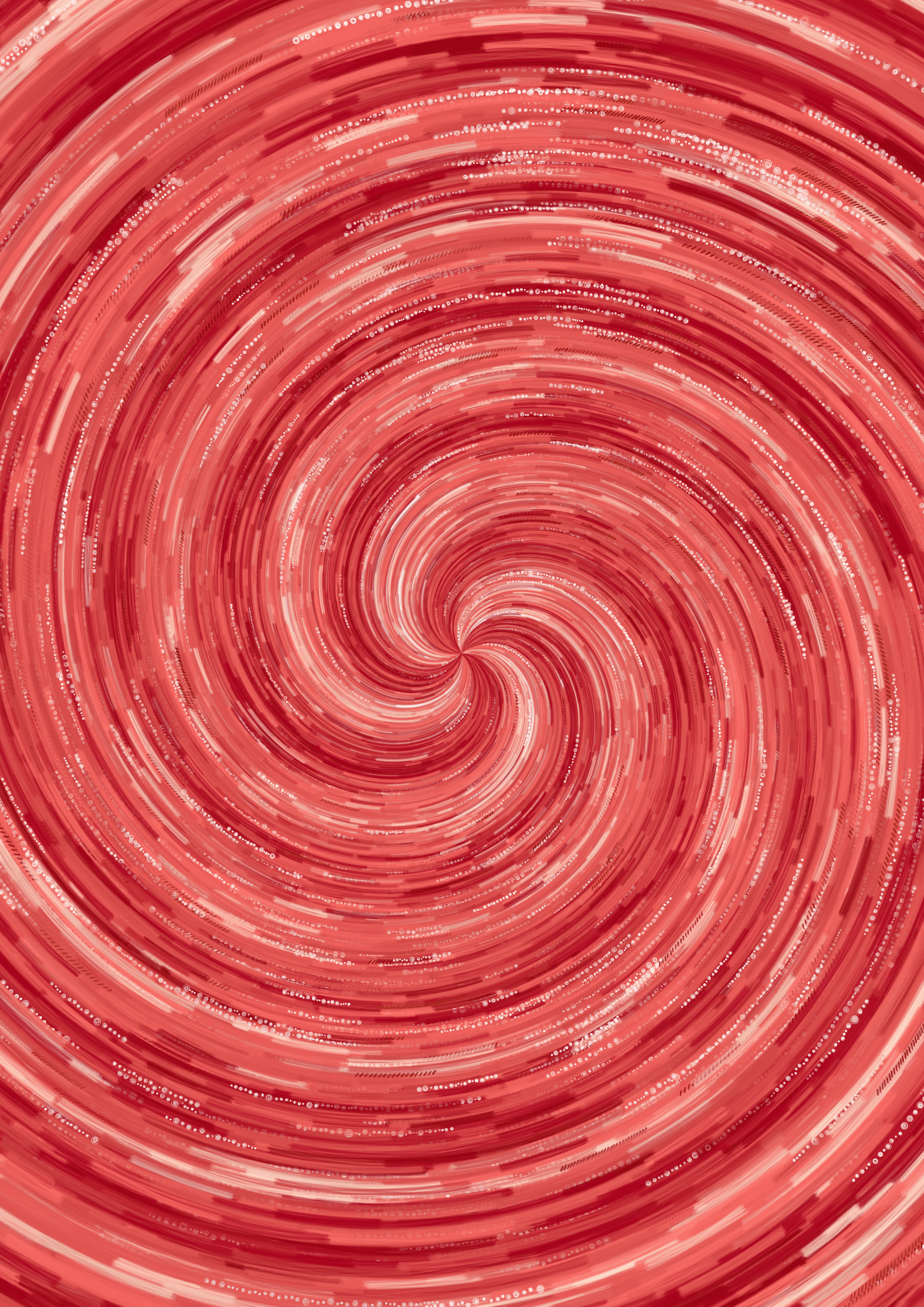
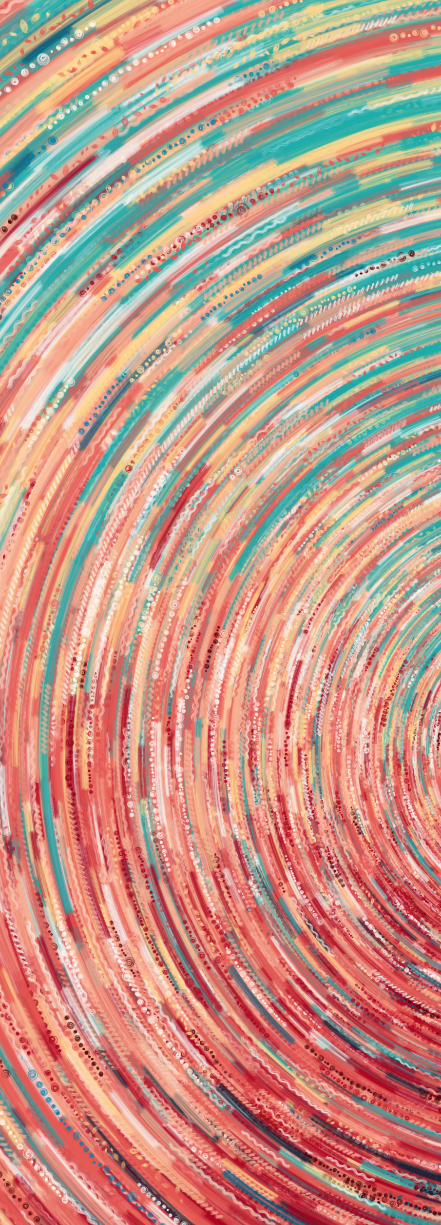
This six-piece data art collection, created for the GDQS Country Story Book by Intake, transforms Global Diet Quality Score (GDQS) data from over 80,000 individuals across 23 countries into vibrant visualizations. Each artwork symbolizes dietary patterns, using distinct visual elements — like wavy white lines for “Whole Grains” and bold red circles for “Red Meat” — to represent the 25 GDQS food groups. The centerpiece visualizes individuals’ dietary data as colorful rings, where the size and color of each section reflect the variety and quantity of foods consumed during a single day. Additional pieces explore unique themes: animal source foods, vegetables and tubers, sweets and processed foods, whole foods, and fruits, each inspired by familiar forms like lollipops or fruit slices. Inspired by universal experiences like shared meals, this collection celebrates the richness, diversity, and cultural nuances of global diets, offering a visually engaging narrative of dietary data and its impact.
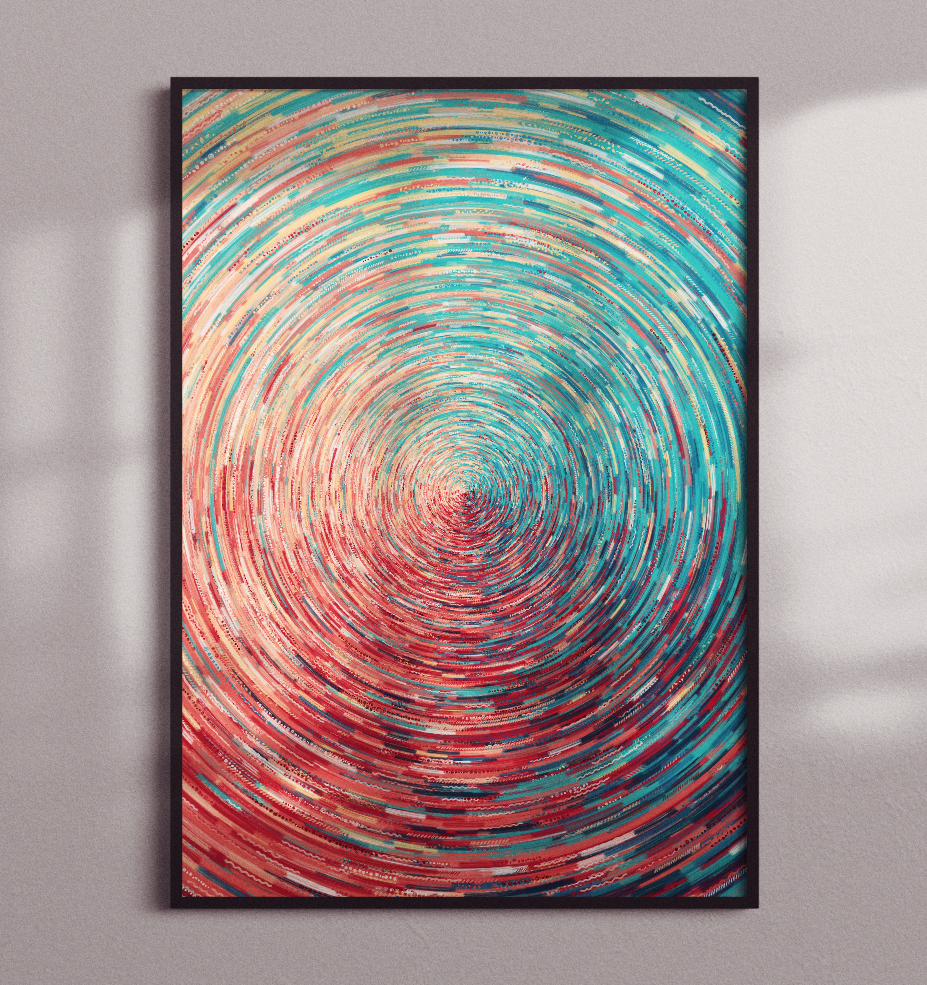
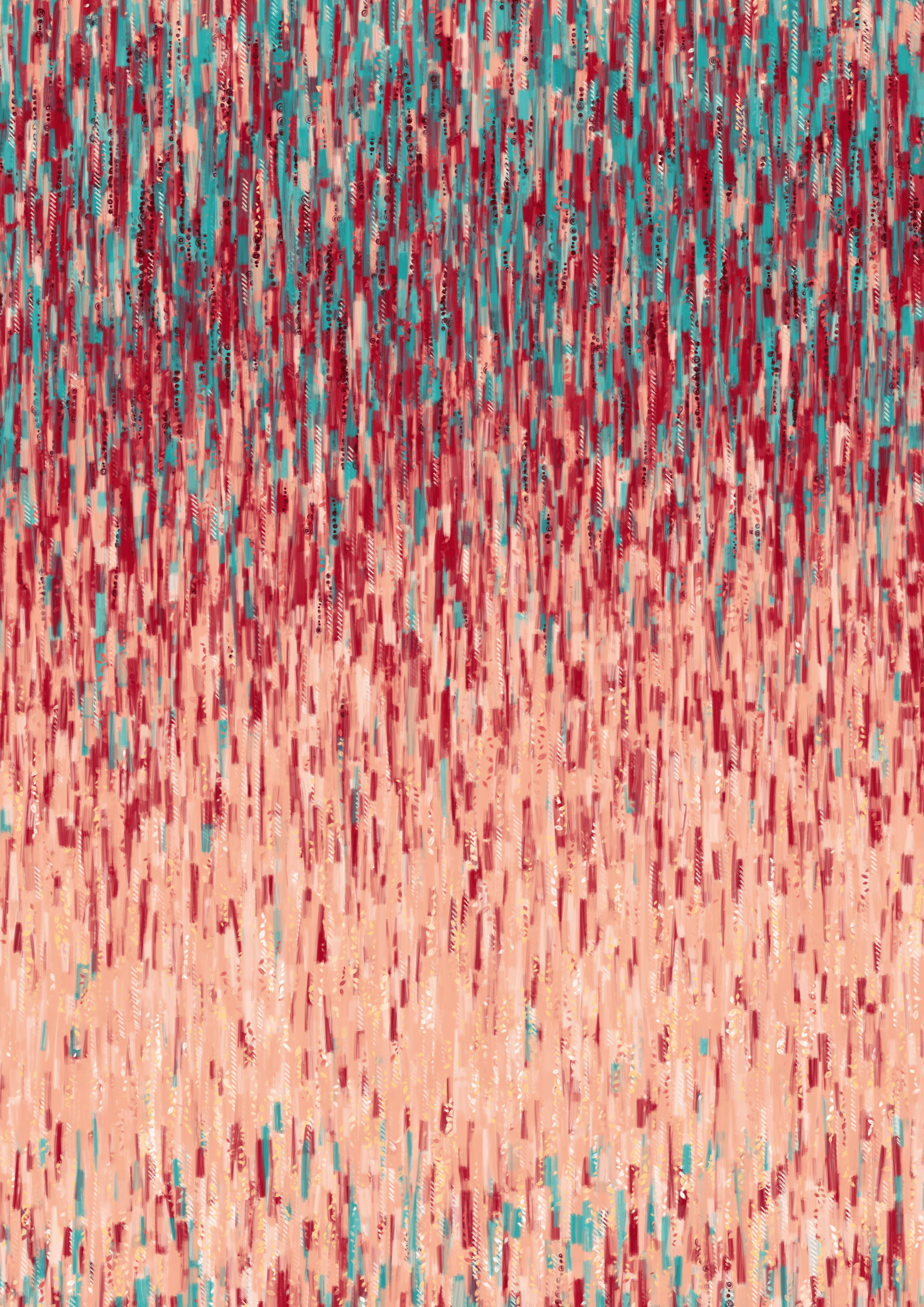
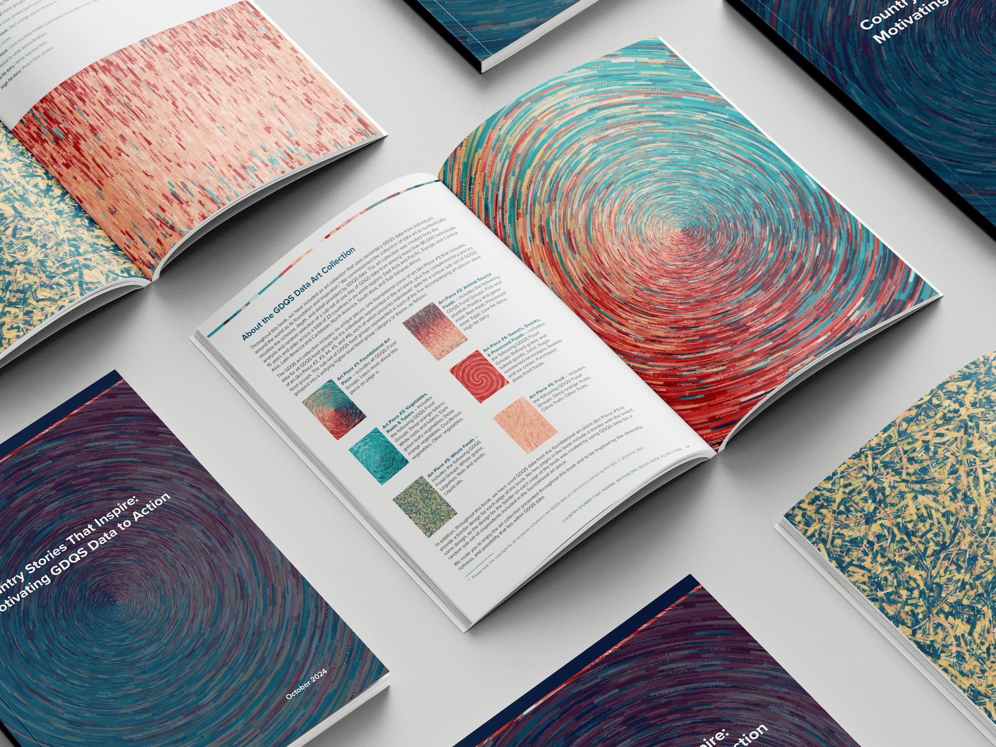
All the pieces in the collection translate the GDQS data into a symphony of color and form. Each GDQS food group has its own unique visual representation; for example, wavy white lines for food items consumed in the “Whole grains” food group contrast with bold red circles for food items consumed in the “Red meat” food group.
For the collection’s cornerstone piece, the concentric rings, person’s GDQS data are visualized along a ring. If an individual consumed one item from the “Red meat” food group, a small (arc)section of that individual’s ring is marked with red circles. The more items eaten from a specific GDQS food group, the greater the length of the (arc)section. For example, if four items were consumed from the “Whole grains” food group, a white wavy line four times longer than the red circle section would be drawn on the ring for that individual. This method was used to place visual markers on the ring for all GDQS food groups consumed by the individual. The same approach was repeated for every individual whose GDQS data are represented in the art piece. The resulting circular form evokes the familiar image of a plate as seen from above. The art piece reminds us that meals are more than just the sum of their ingredients. They are intricate, unique compositions, informed by culture, context, access, and availability, with implications over the long-term for the nutrition and health of the individual.
Each of the remaining five artworks focus on a different subset of the GDQS food groups. For example, the Animal Source Foods artwork delves into the world of animal-source foods. Its elongated, undulating form echoes the graceful lines of muscle fibers. You can find more information about each of these pieces spread throughout the GDQS Country Stories report.
