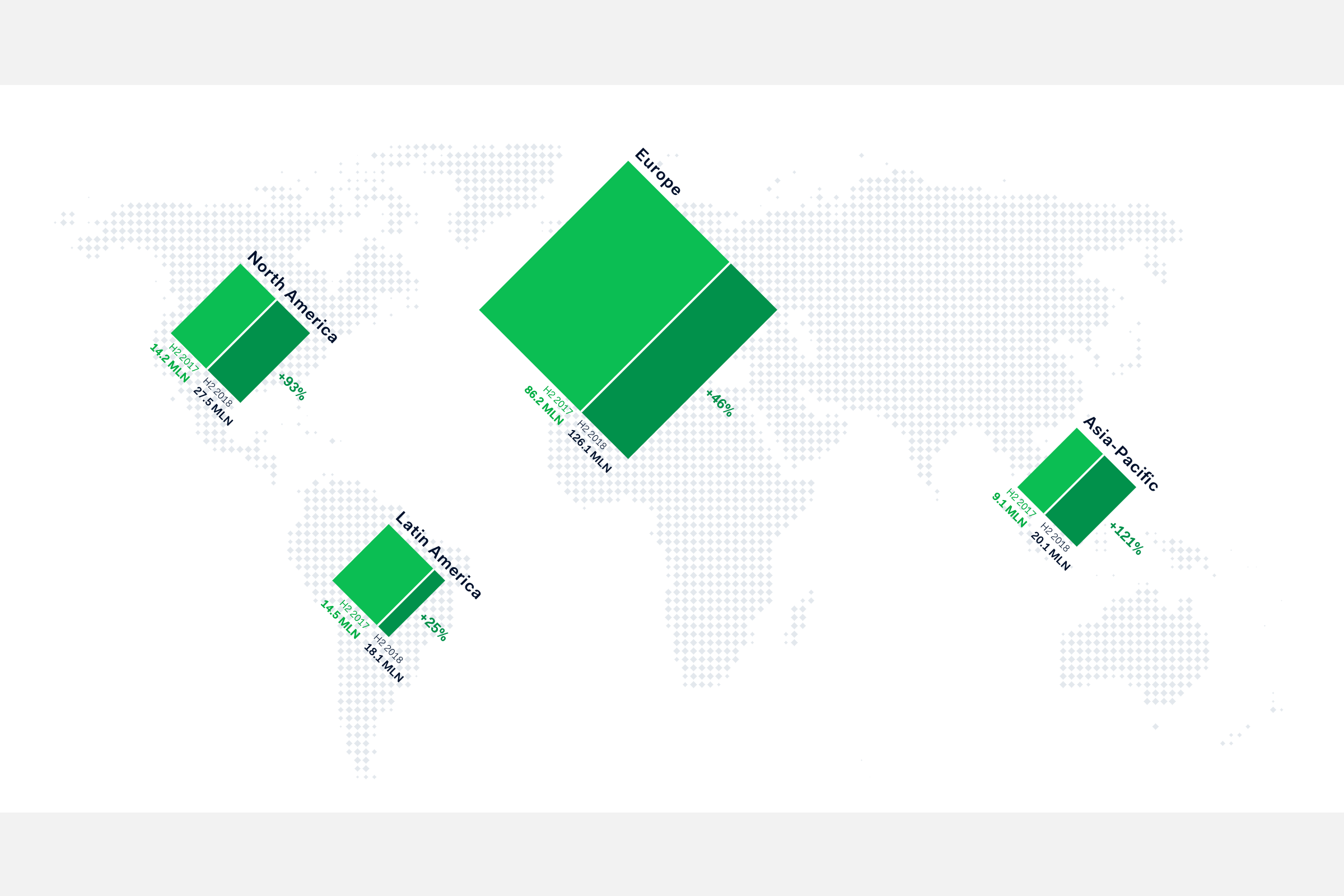
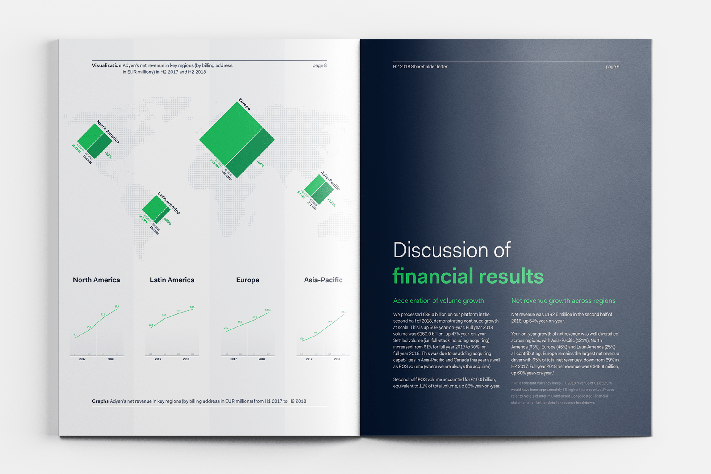
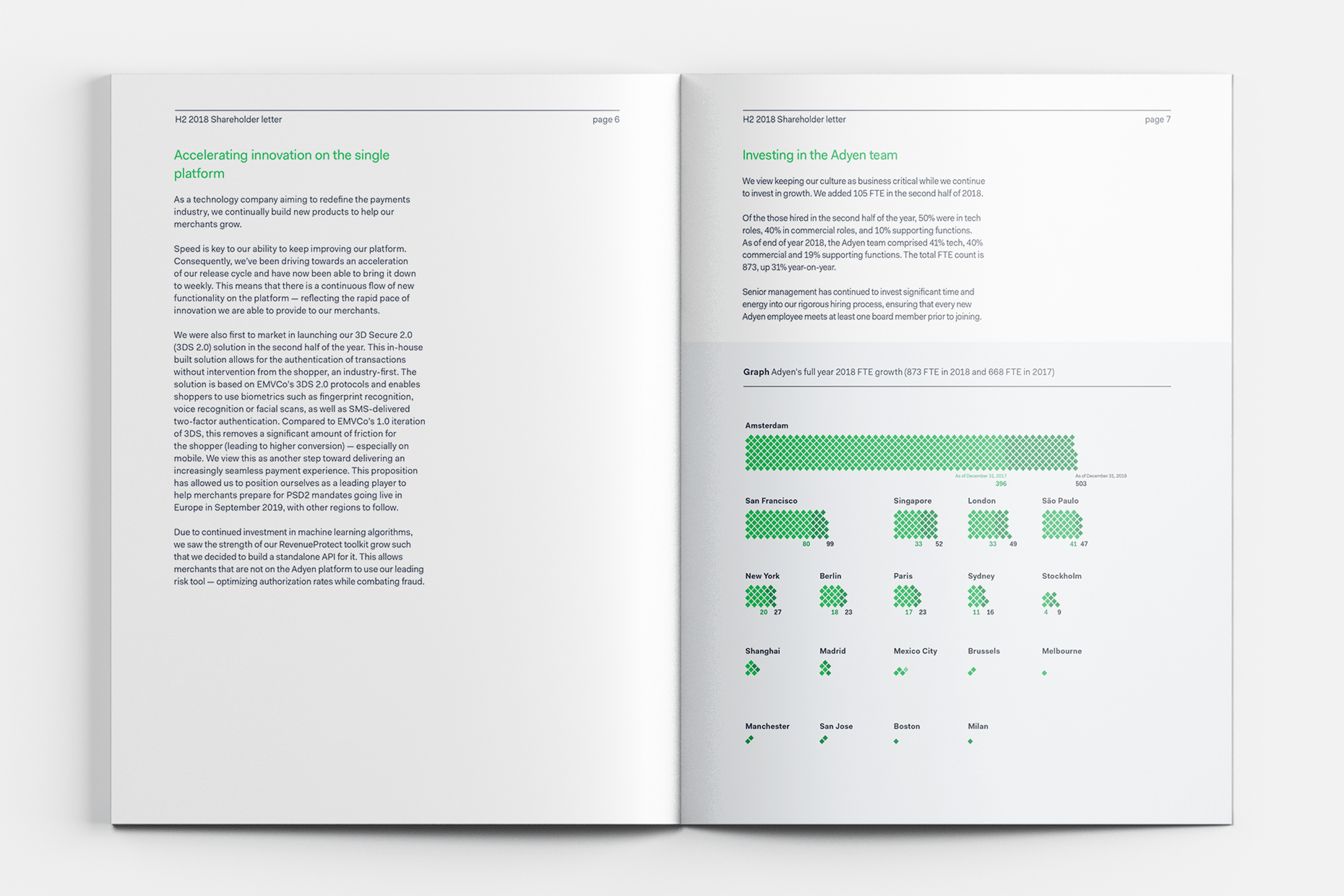
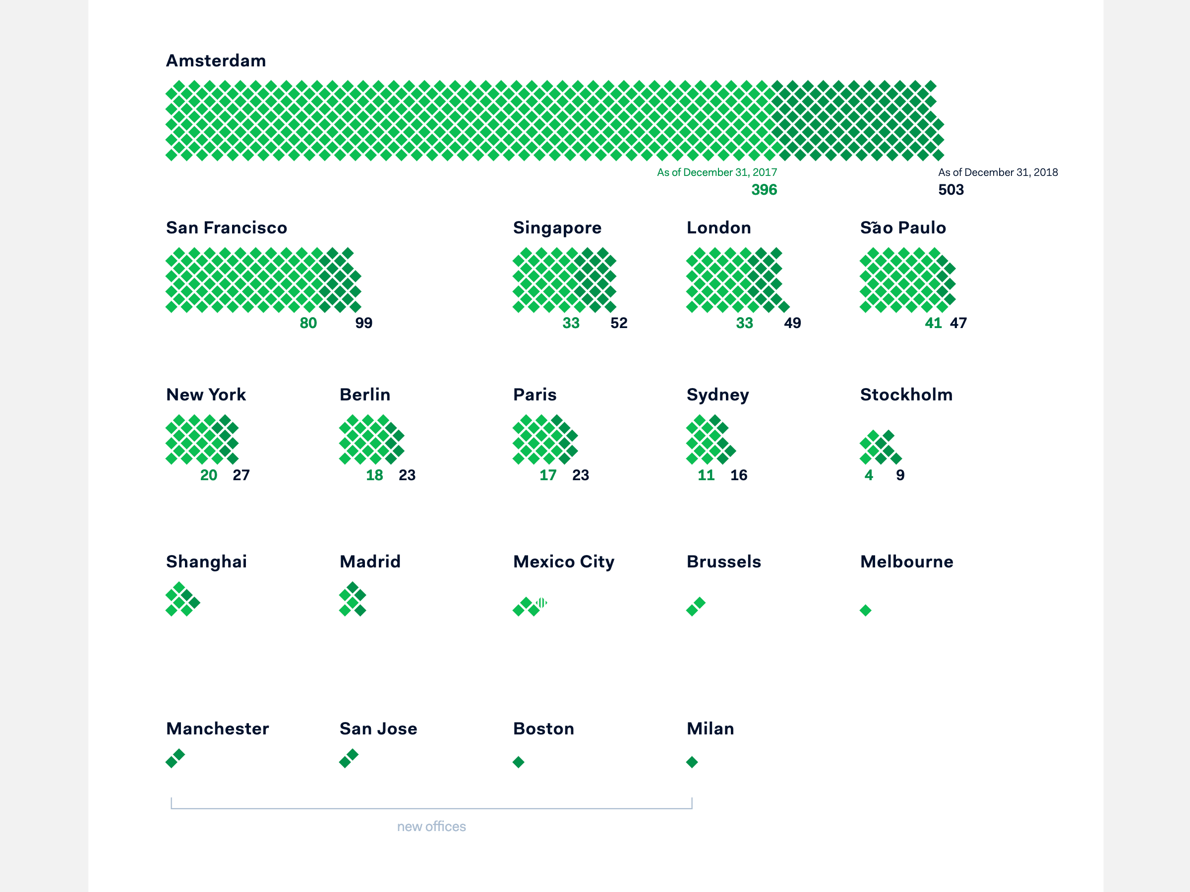
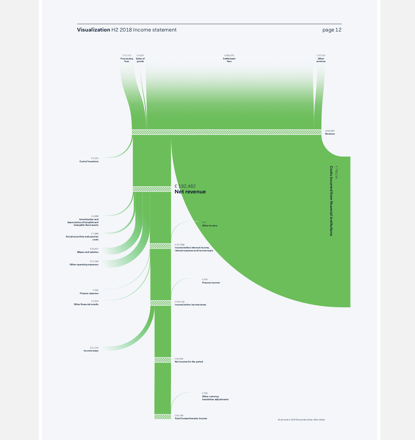
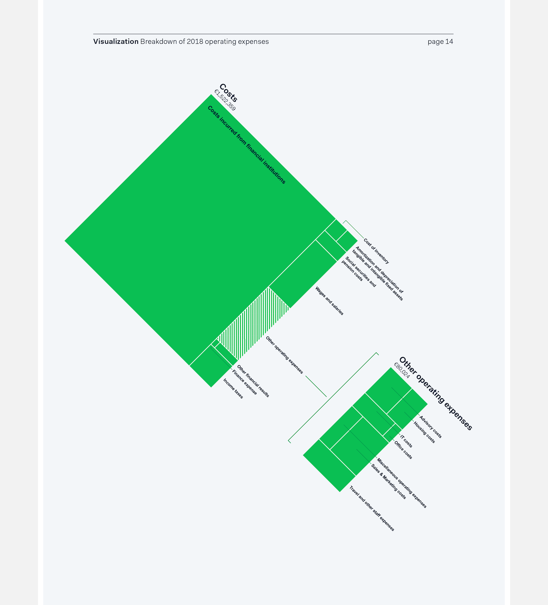
Adyen wanted to feature more then just text and tables in their second ever shareholder letter & annual report and reached out to me to help them. Looking at the data that is presented in the report, I looked at what information would lend itself to be visualized in an interesting and effective manner. This eventually turned into the creation of four more extensive visuals about the income statement, costs, regional and FTE growth.
All of these visuals were made completely with the use of JavaScript and d3.js, not Illustrator. The main reason was the fact that the final numbers could change (slightly) until just days before the publication, making it quite a chore to have to remake these if they were all crafted in Illustrator.
Furthermore, by programming the logic of these visuals, I could prepare 90% of the required effort a month before the deadline by using the numbers from the previous report. When I finally received the final numbers, it was only a matter of changing the underlying data, and some small tweaks to get these final visuals ready.