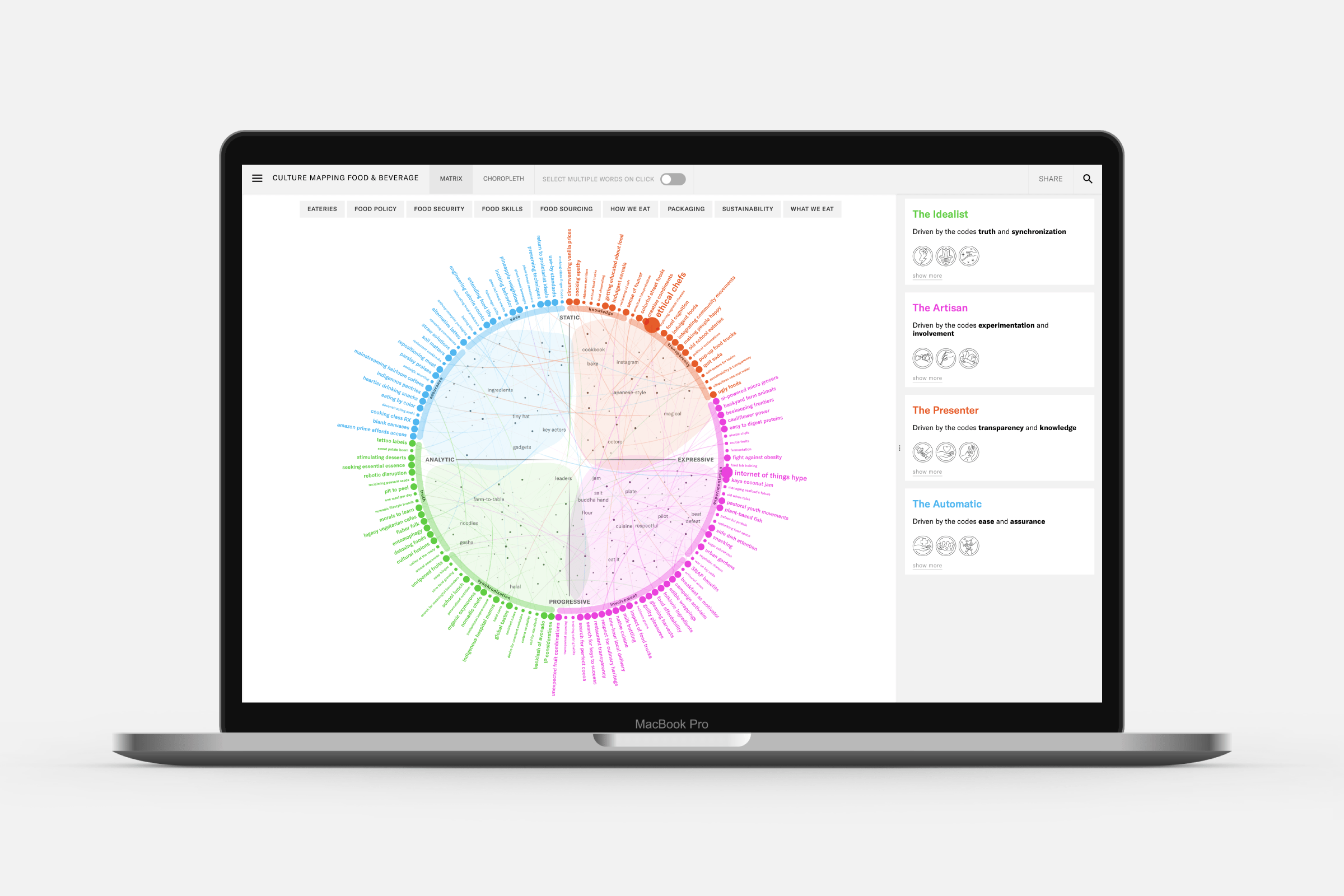
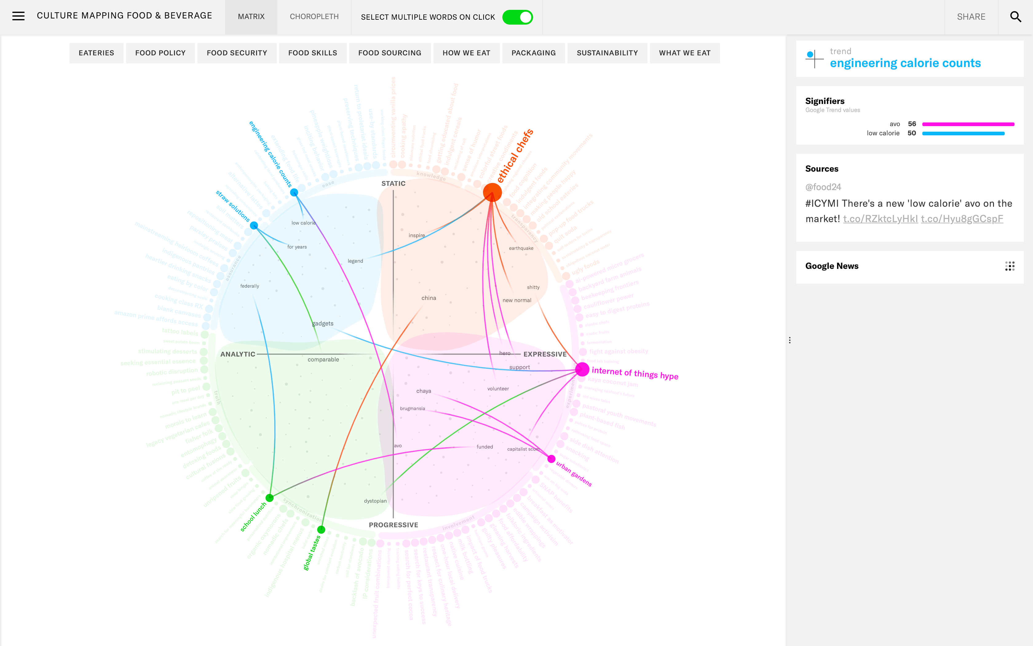
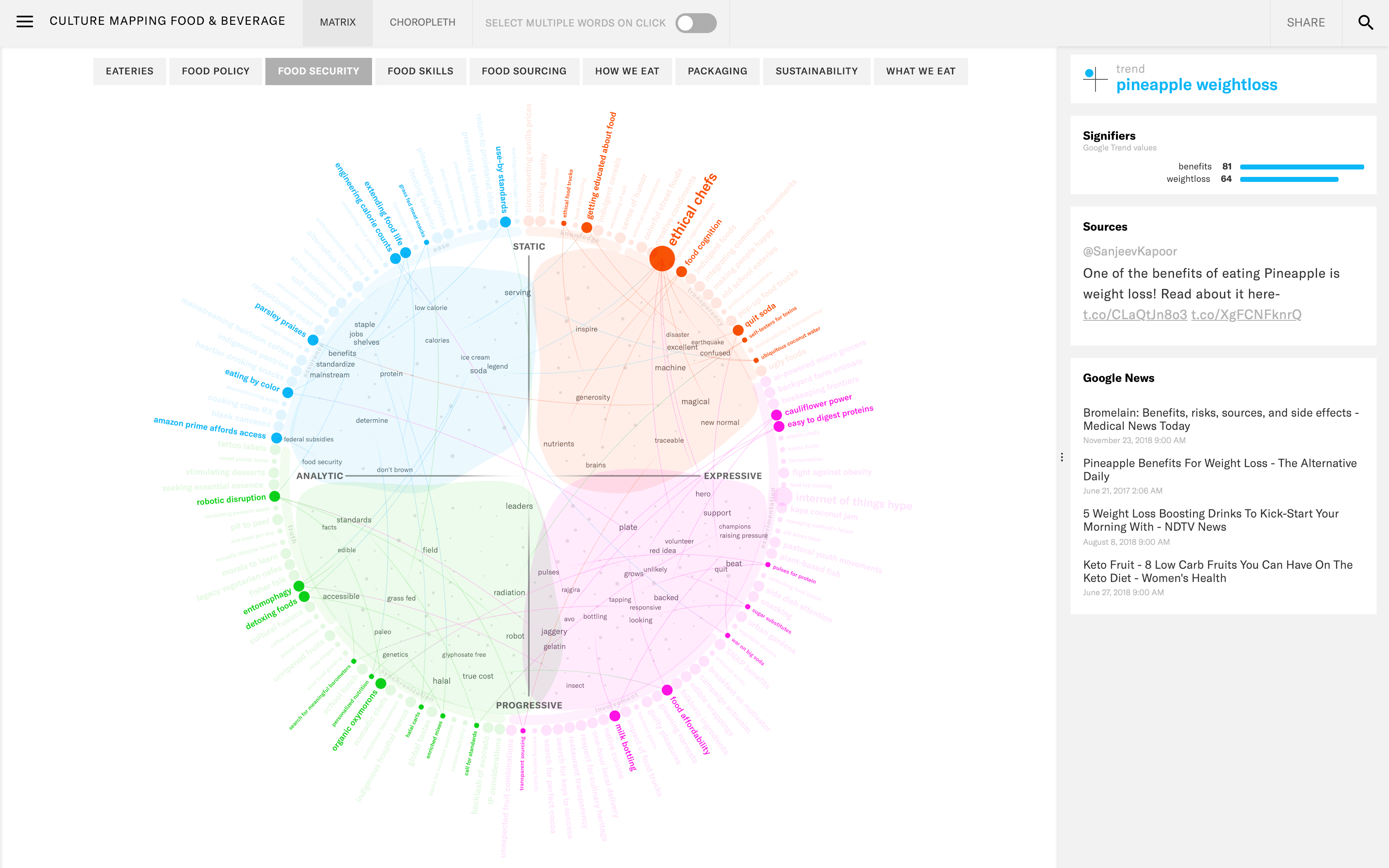
The client, scenarioDNA, has a (patented) data-driven method that addresses the study of people and their ideologies over time. The best way to understand where ideas are going is to see where they live in the context of near neighbors and contrasting ideologies. They had an existing interactive tool that let their users explore the data and insights. However, this tool was perceived as being too dense and complex to understand. ScenarioDNA asked me to create a new version that would hold true to their patented approach, encourage users to explore, and be understandable. I created a fully functional visual prototype, based on their Food & Beverage dataset, and design for the surrounding UX elements.


This project started with several calls, emails, and documents to try and get to reasons that the client had found why their users were having trouble with the current interactive visual. I created a list that outlined each identified issue, both from user experience, and from data representation points-of-view. Using this list I started from scratch, designing and building up a new visual, while not deviating too much from the original’s style.
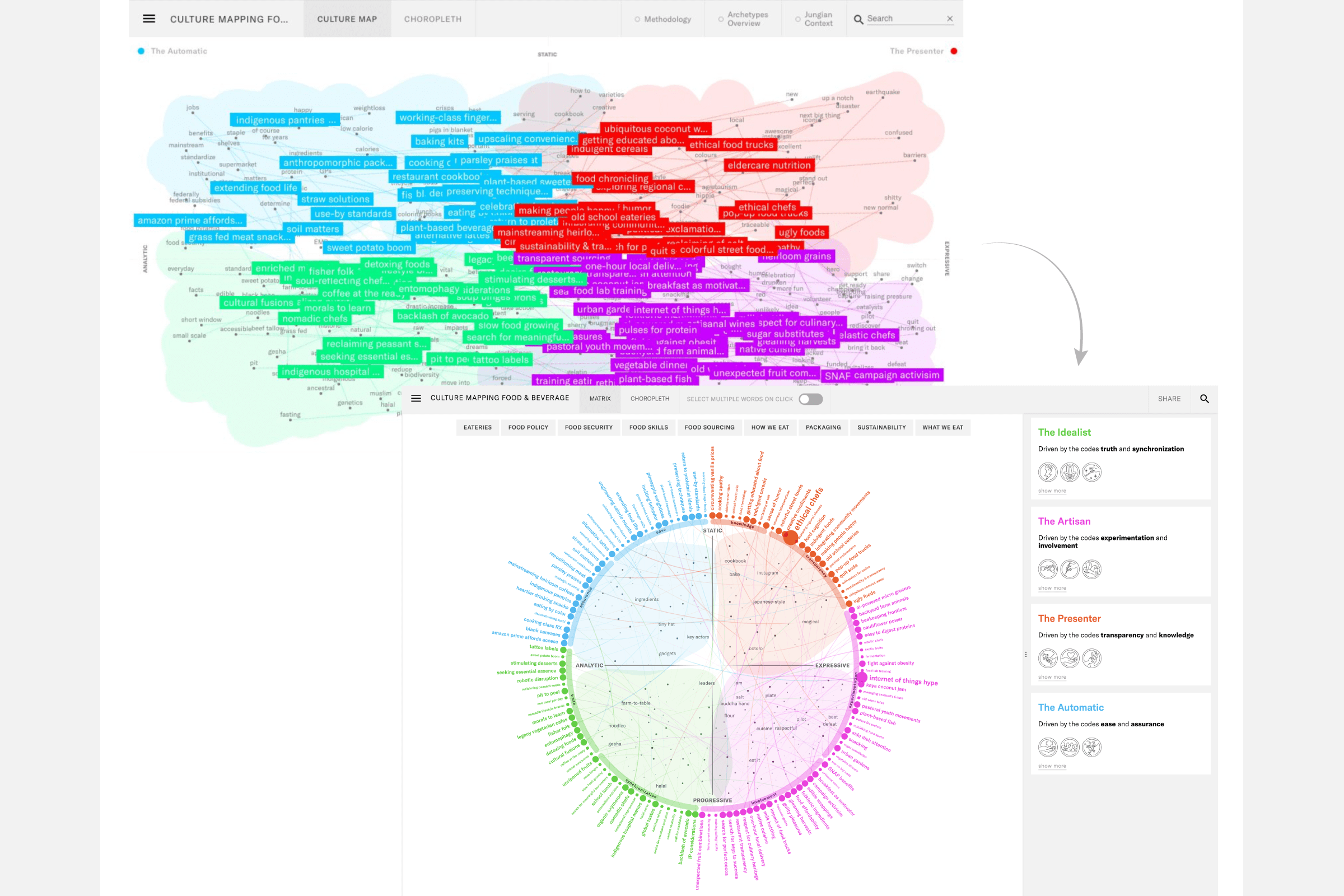
The client was very enthusiastic when I suggested a radial visual style, instead of their original rectangular set-up, thereby reducing the overlap that was present in the original visual, and separating out the trends from their signifier words (now in the center). In the image below you can see a screenshot of the original version, compared to the redesigned one.

