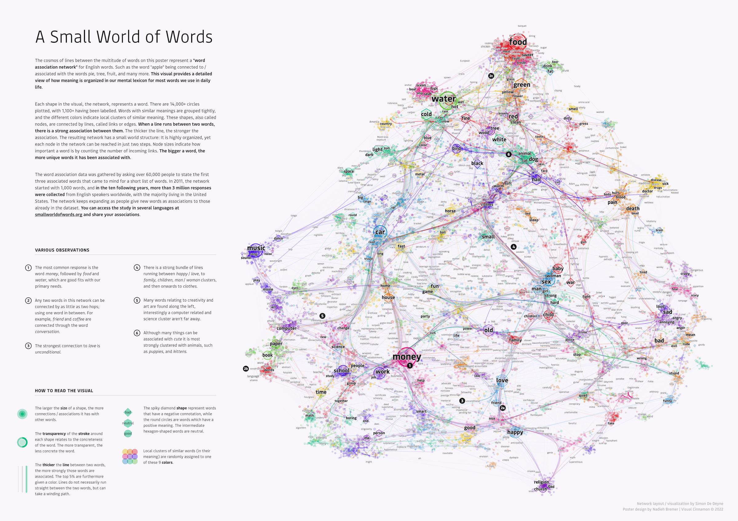
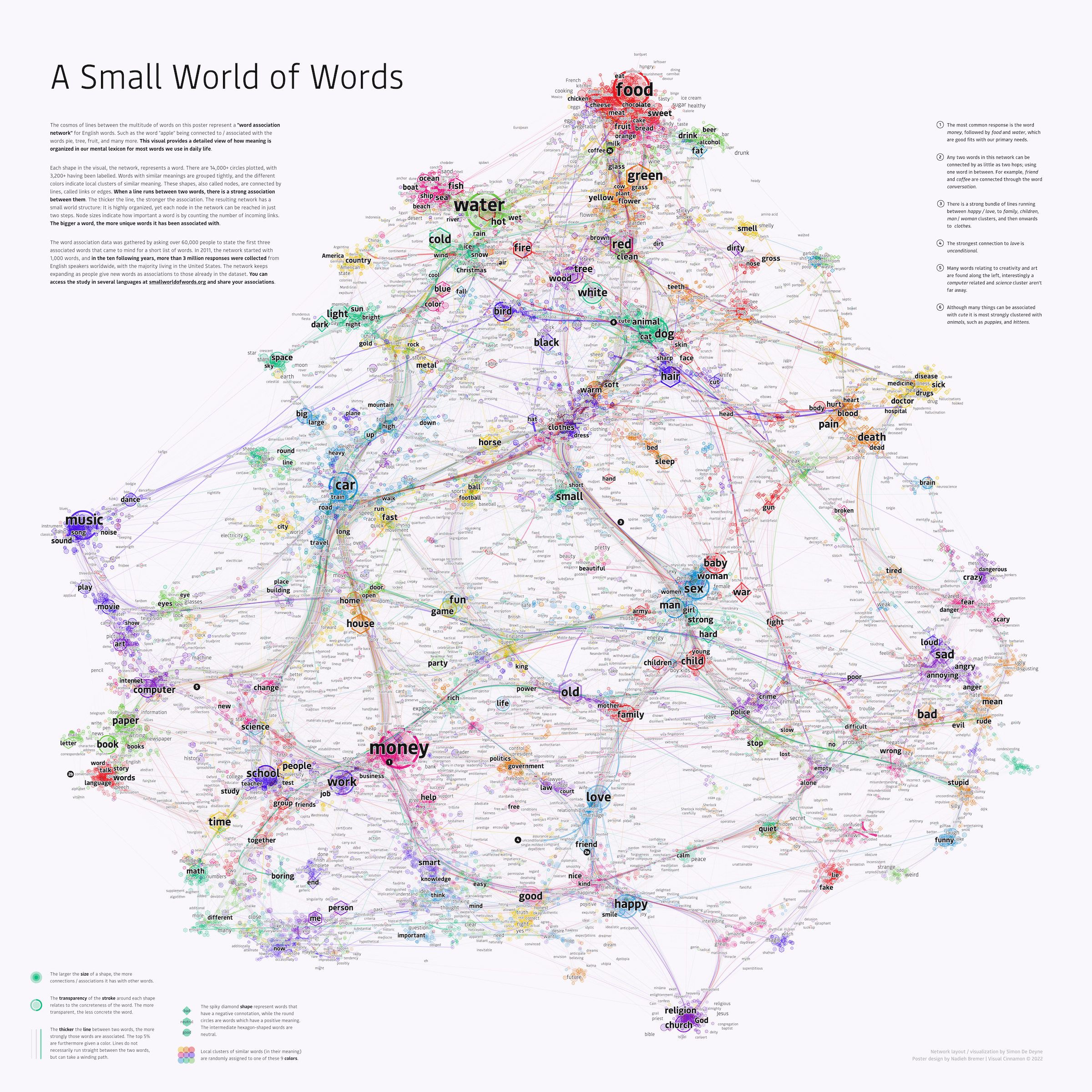
The Small World of Words project had celebrated its 10-year anniversary and wanted to create a poster about the data it collected during this time to celebrate. This research project, led by Simon de Deyne, looks at how people associate words, asking for the first words that come to mind when presented by a specific word, such as “apple”. The client prepared a script to turn their dataset into a network after which I took over to create the visual design; usage of colors, incorporating extra variables, fonts, layout, legends, etc. I created two versions; a big square poster of 70x70cm that was able to show 3,200 word labels, and a smaller poster at A3 size having 1,100 of the circles labeled with the word they represent.
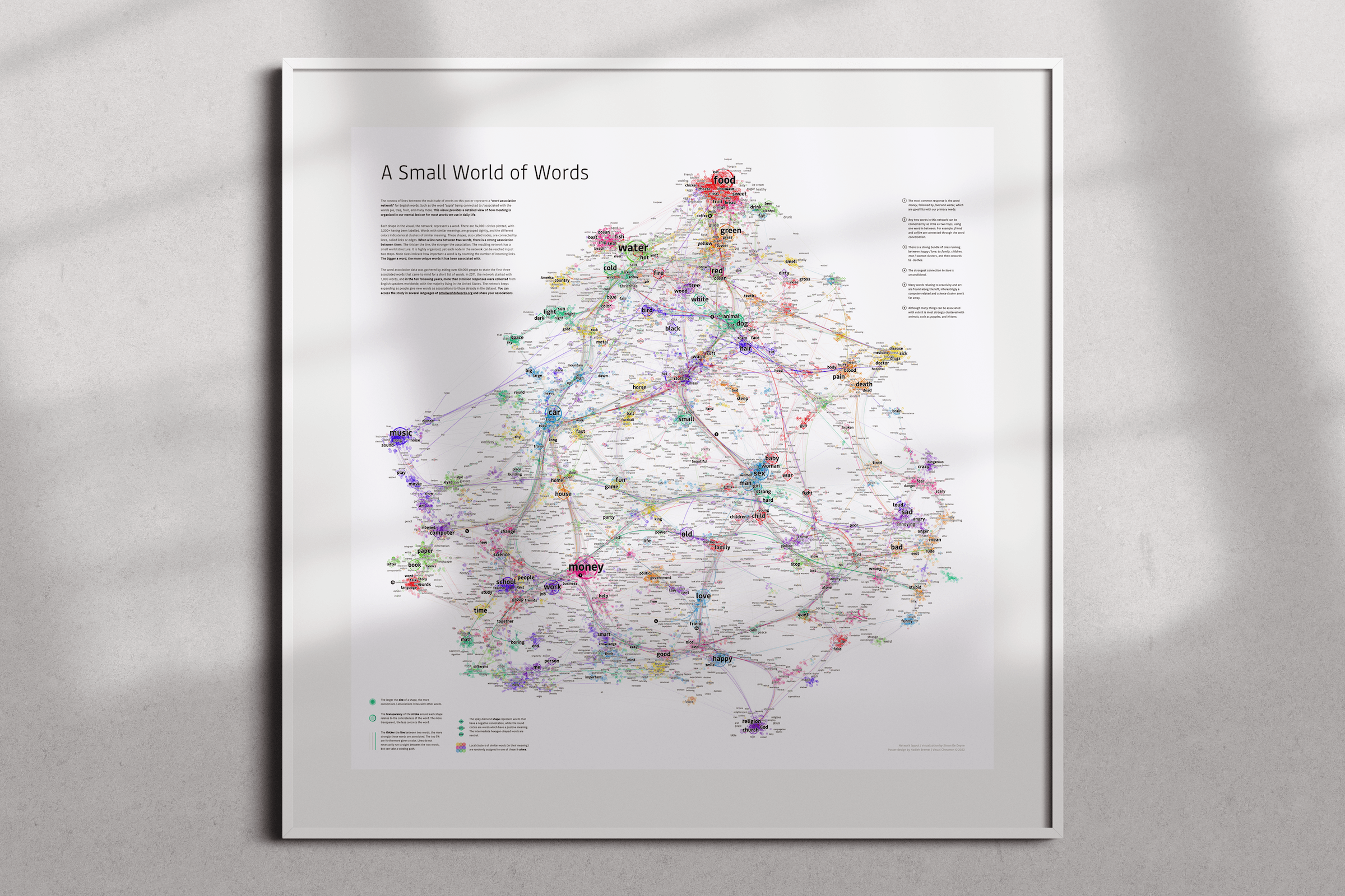
Due to the complexity of this network I had many email conversations with the client about what exactly to visualize. Could we show the entire network without it becoming a “hairball”, or should we show only a small subgroup from it?
The client was intimately aware with the data and how to analyze it, they therefore did all of the data analyses throughout this process. Eventually creating an R script that would apply a UMAP on the word dataset to lay them out in a 2D plane and next running an edge-bundling algorithm to guide the thousands of links between words.
I took over afterwards to turn the default results from these algorithms into a visually appealing poster. Deciding what links to show, adding colors, gradients, shapes, and the overall design of the poster with the placement of the texts, the legends, fonts, etc.
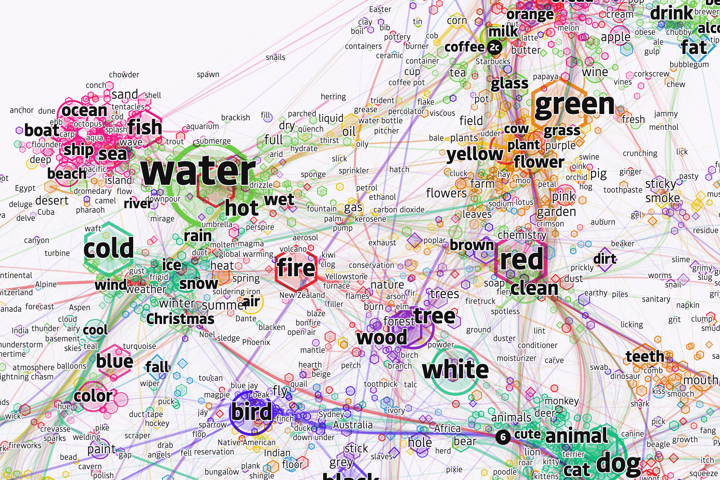
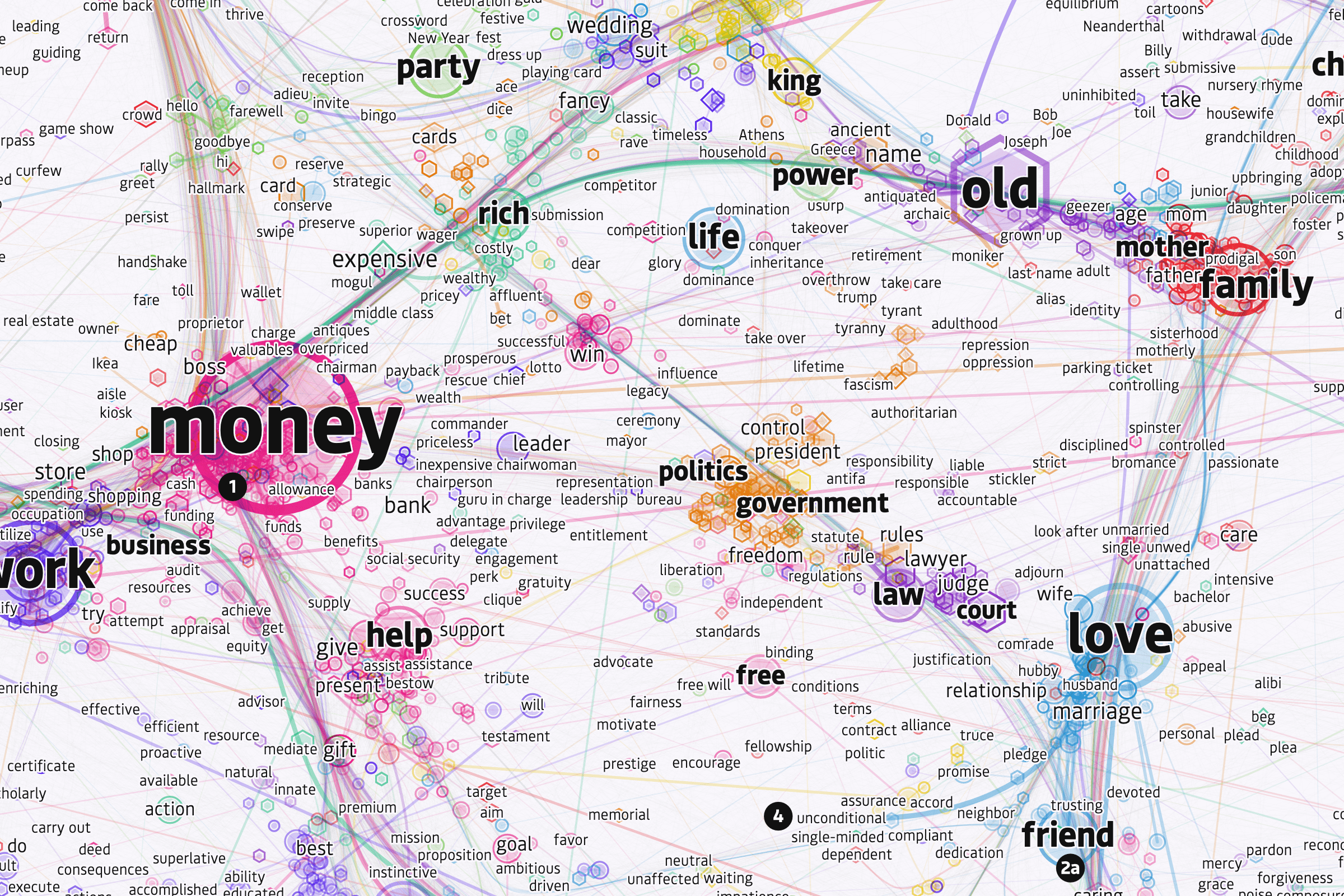
Each shape in the final network represents a word. There are 14,000+ shapes plotted, with several thousand having been labelled. Words with similar meanings are grouped tightly, and the different colors indicate local clusters of similar meaning. When a line runs between two words, there is a strong association between them. The resulting network has a small world structure: It is highly organized, yet each node in the network can be reached in just two steps.
