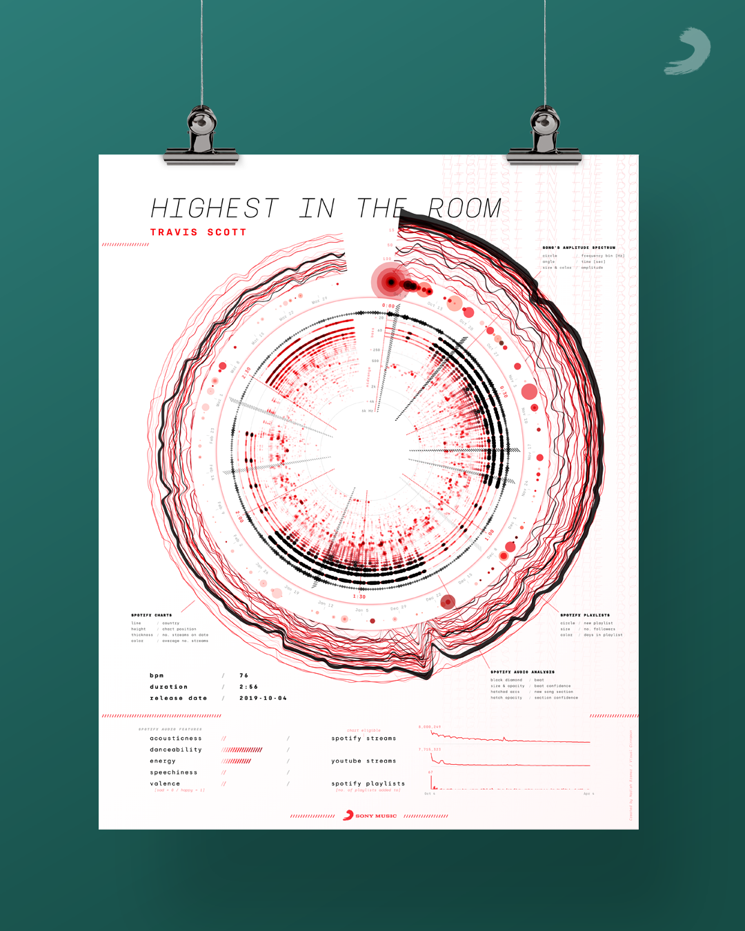
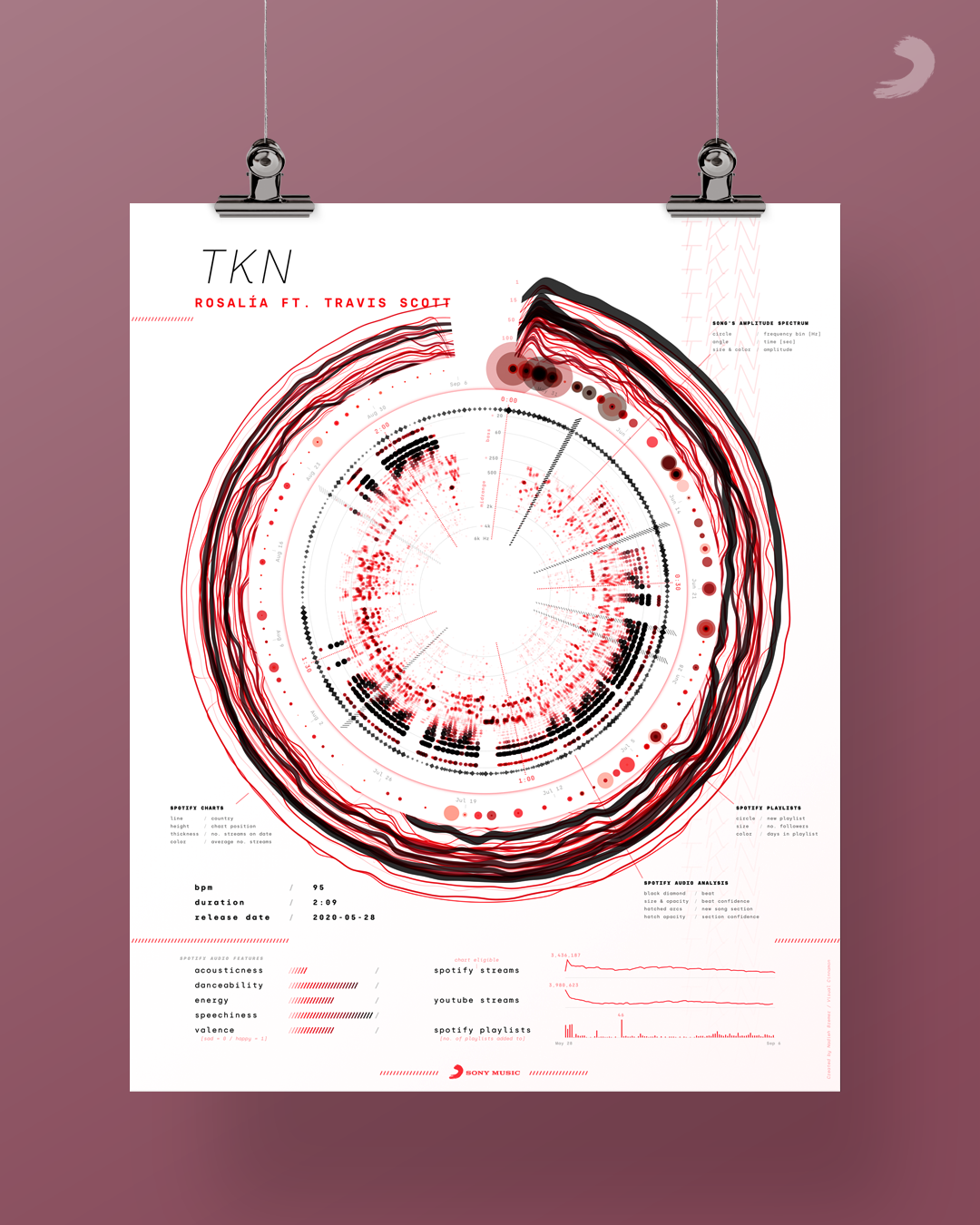
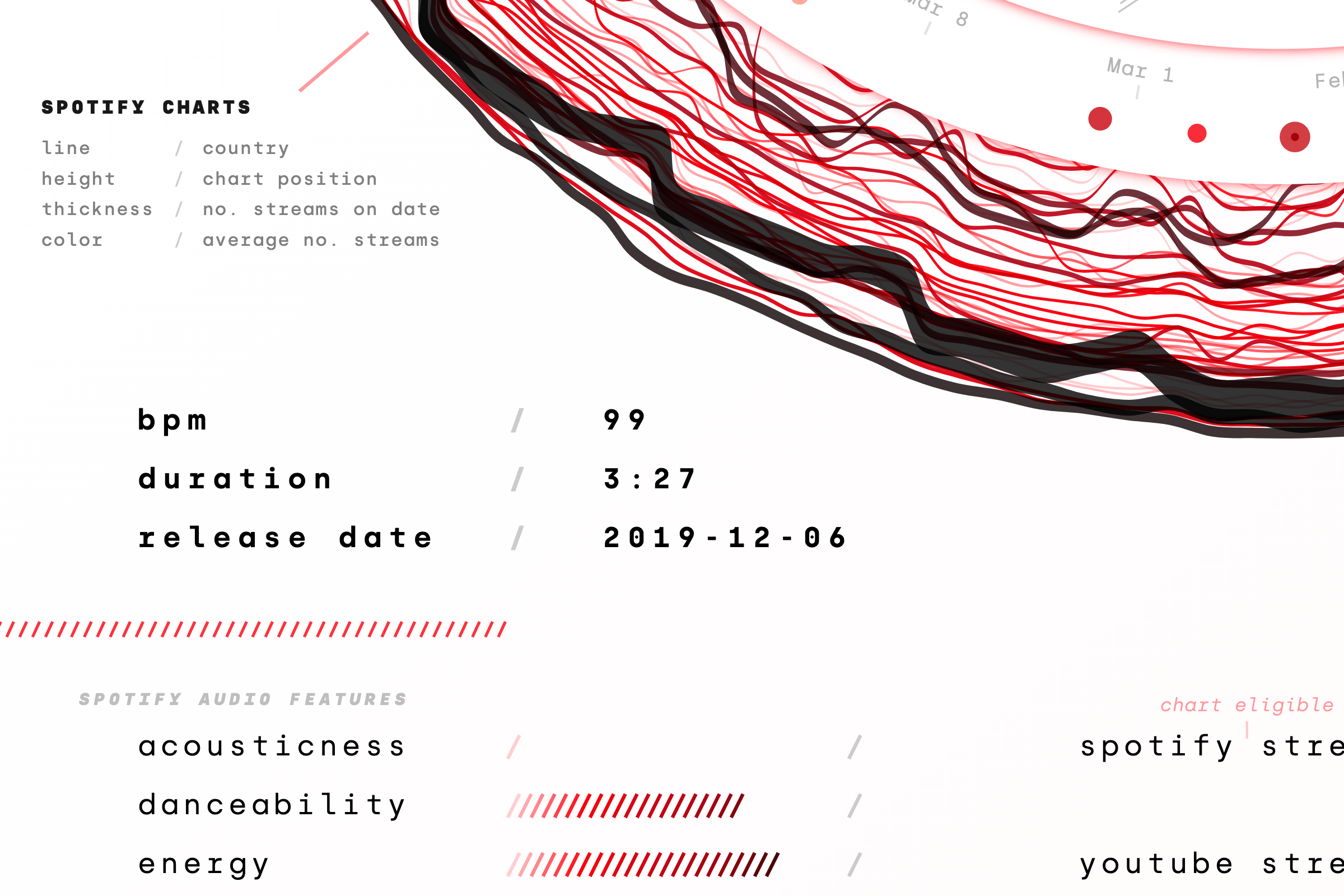
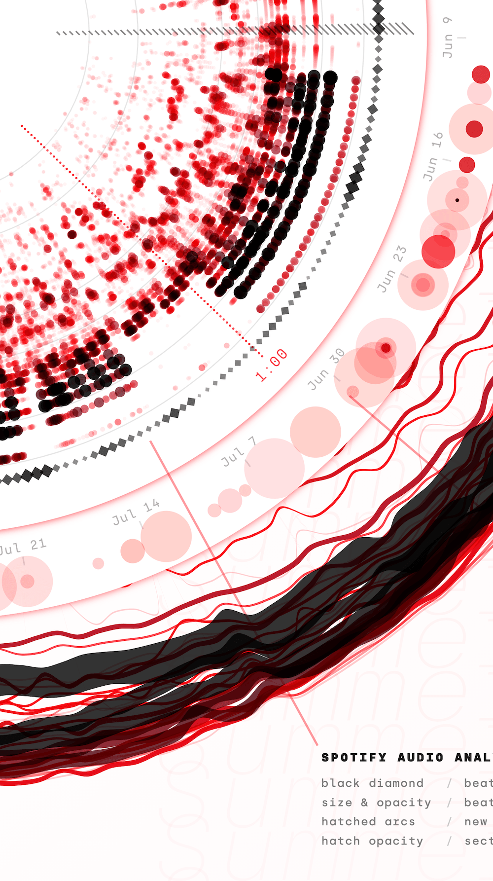
Sony Music reached out to collaborate on creating a data-driven re-imagination of the ‘gold record’, the record certifications plaques that celebrate milestones in the journey of a song or album. Using data from the music itself and from Spotify and Youtube, such as the streams, playlists and chart positions, I created a data art system that creates a unique poster that shows the “data fingerprint” for each song. These posters are meant to be printed at the same size as the original gold records, at 40x50cm. I therefore had a lot of room to add visual details from the elaborate datasets. I aimed for a type of work that should be placed on a wall and every time you walk by, you can read a bit more and learn something new for weeks and months. Something that’s worth it to print and frame, that keeps on giving insights the longer you look. Something that you can appreciate visually in an instant, but it takes longer to gain insights (should you even want to).
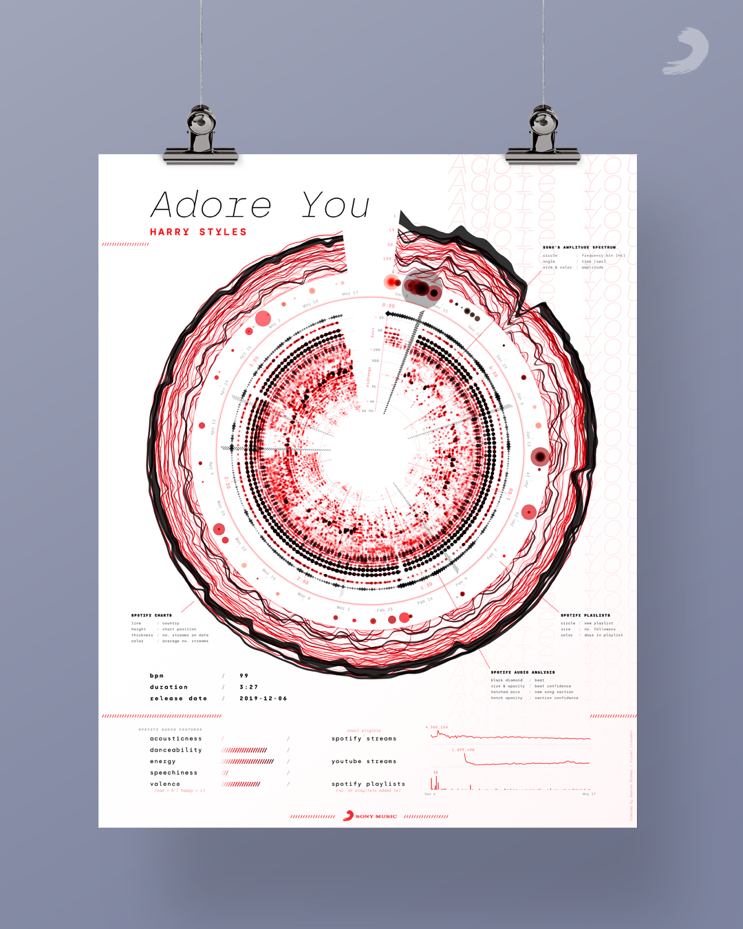
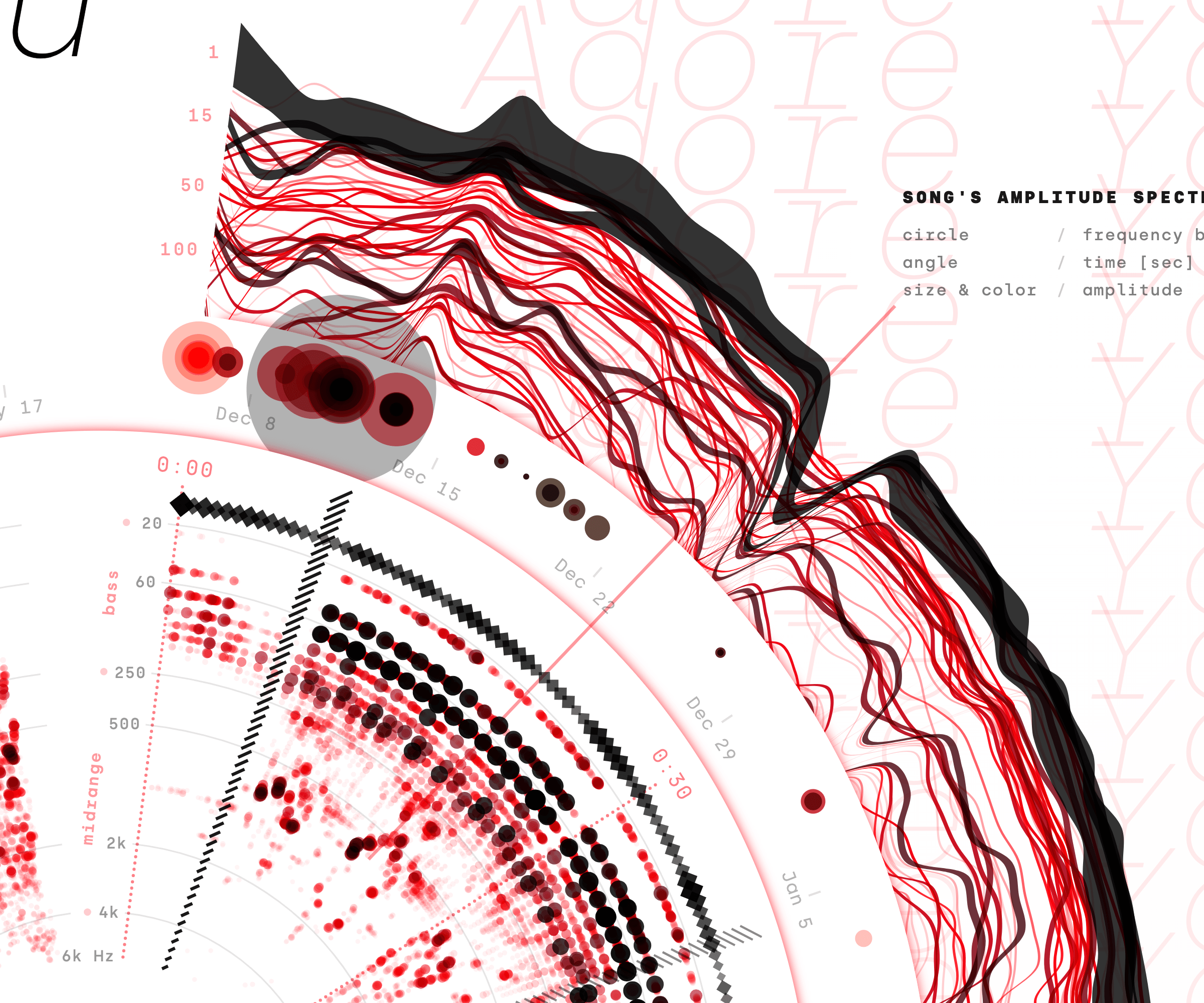
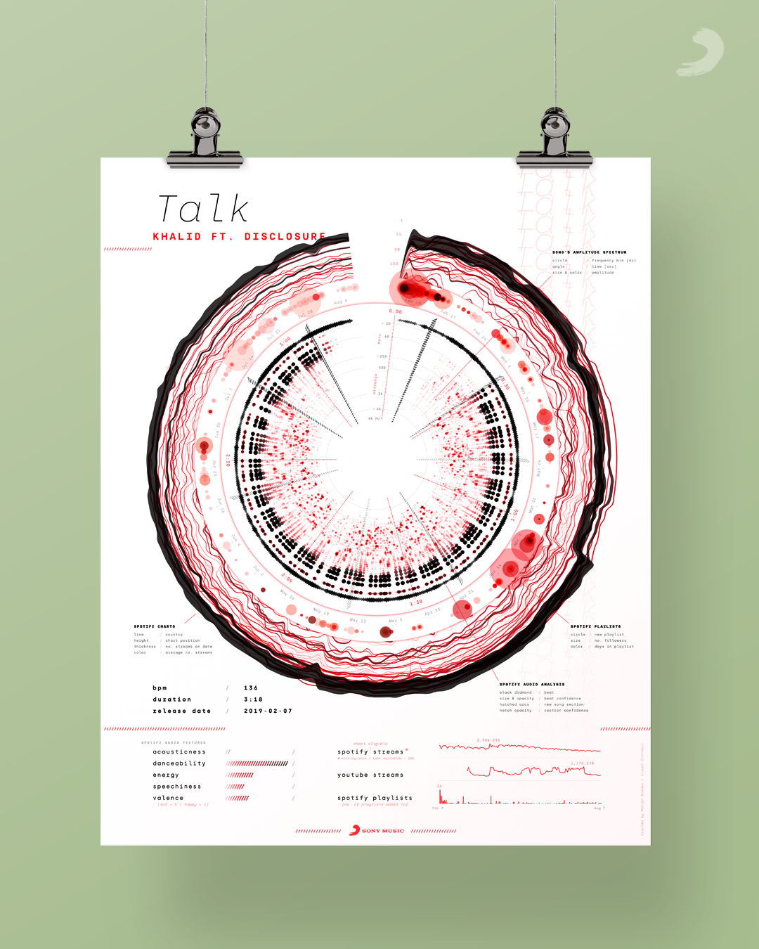
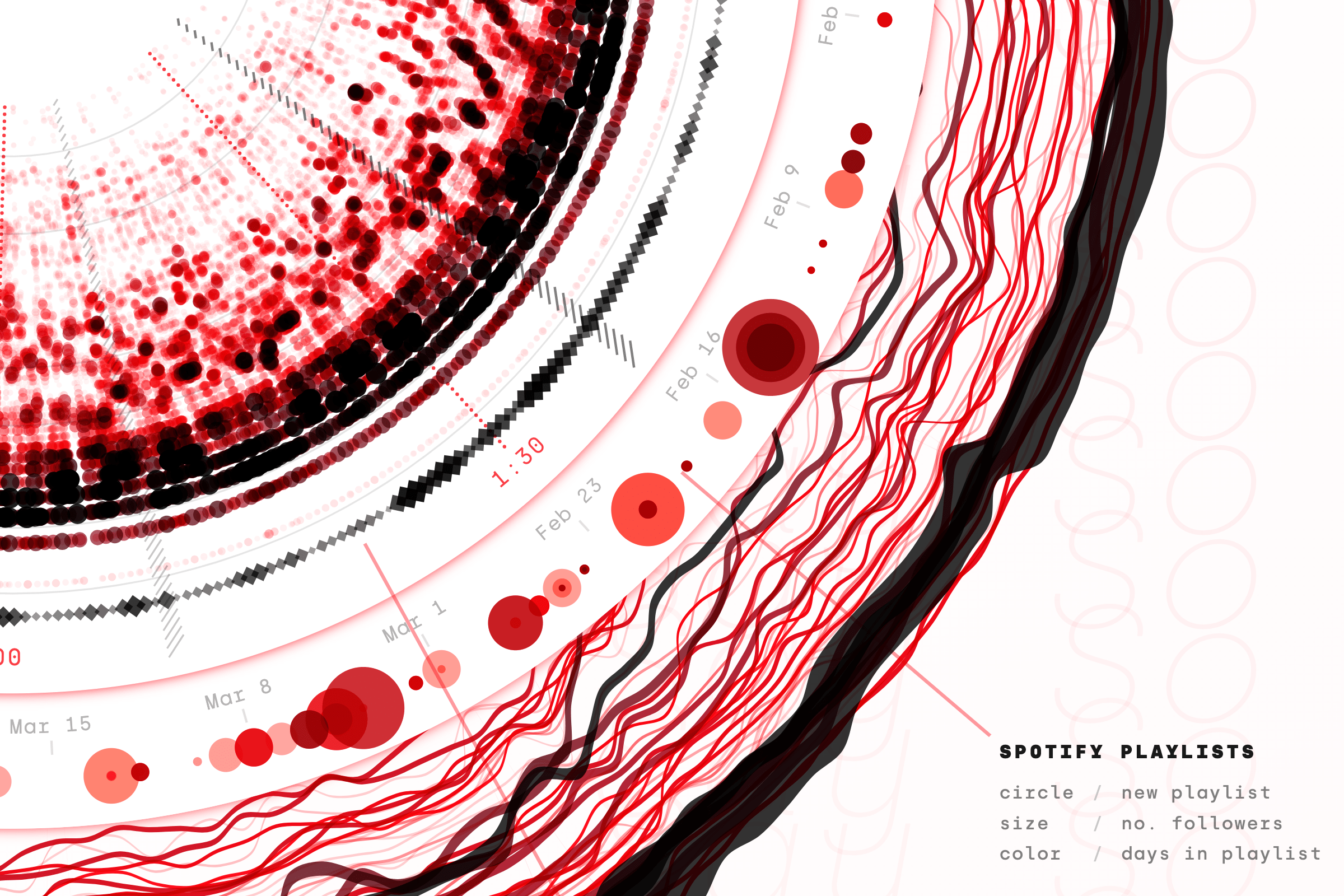
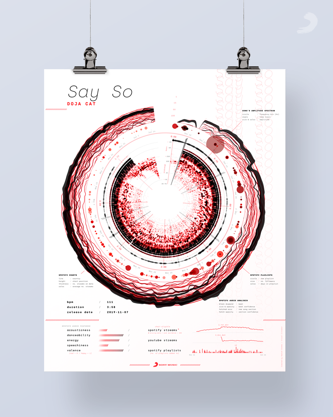
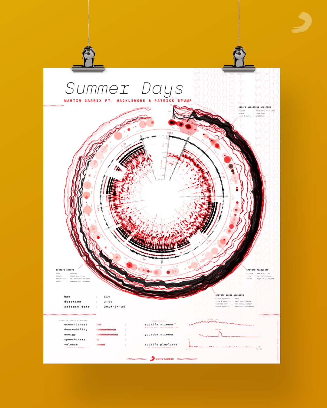
From the start I knew that I wanted to create a poster that would feature a giant circular data-driven central part, just like the vinyl records that you often see in the traditional gold record plaques. However, how that central circular visual would need to look was a long, but fun, process of iteration. From learning about how to analyze music itself, to not giving up when some ideas just don’t feel right enough.
Sony Music actually asked for the creation of a blog to be part of the project. Therefore, you can thank them for this very long and detailed design blog about the creation of the posters.
You can find high quality posters (that can be printed at 40x50cm with 300 dpi) of six songs on the Sony Music release blog and they intend to release more posters throughout the next weeks/months.
