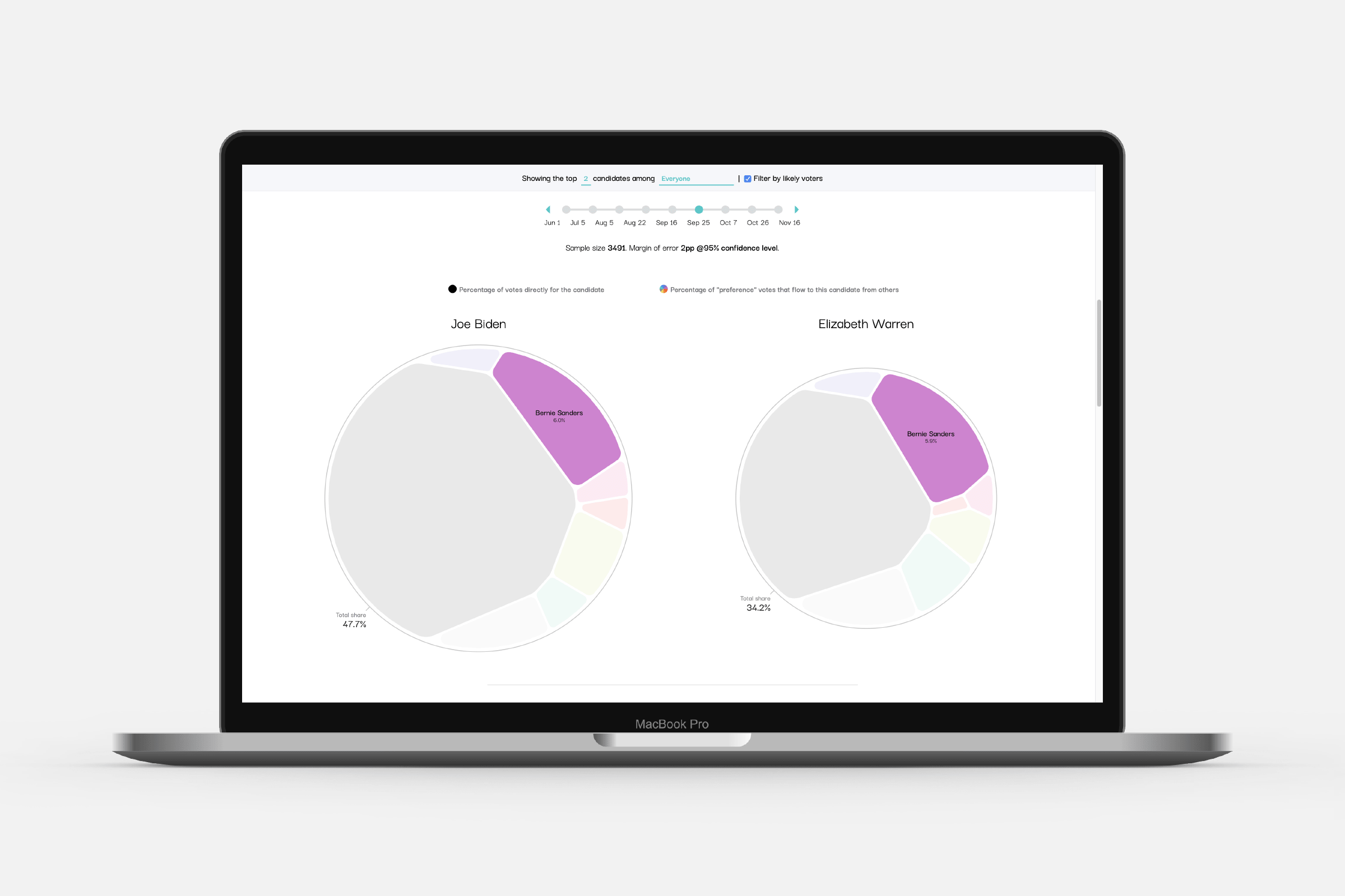
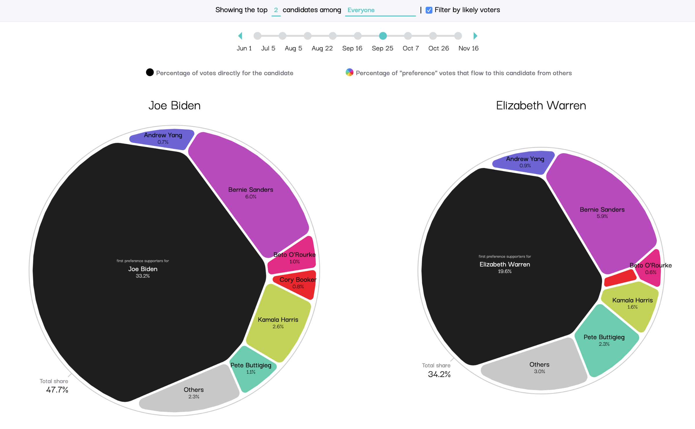
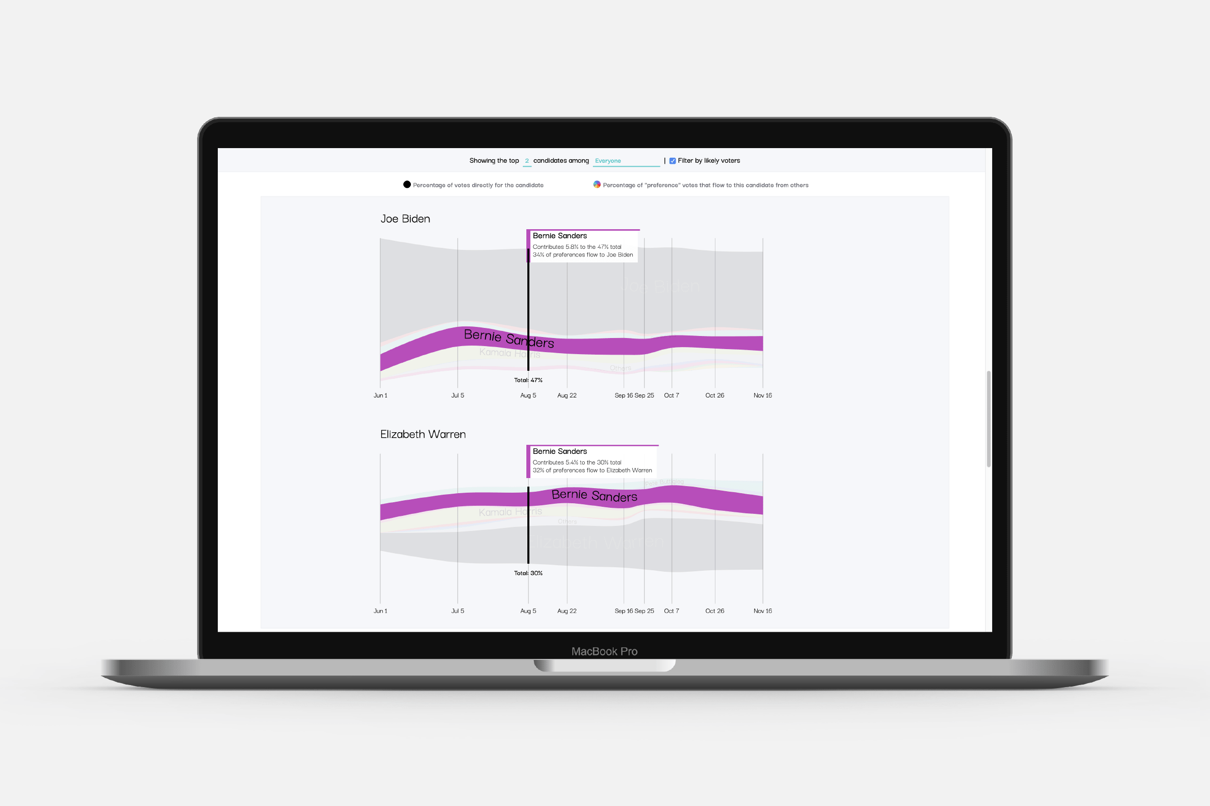
Swayable was looking for a way to visualize the results of their “preference polls” on people’s ranked-choice votes for the (democratic) candidates for the 2020 US elections. They perform a simulated instant-runoff election, eliminating candidates with the least support and distributing the vote of each supporter to their next-preference candidate. I created two data visualization prototypes for them, capable of working with new data (new polls) and have a visually distinct look. Swayable has implemented these in internal environments and client meetings, but have also revealed the visuals in a blog post.
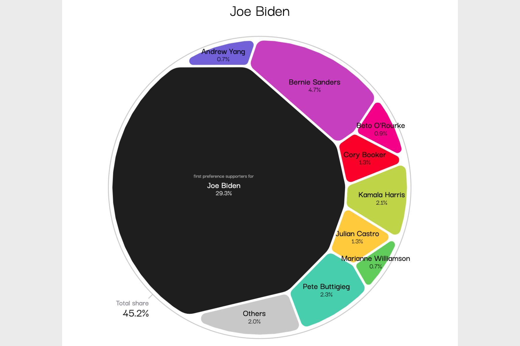
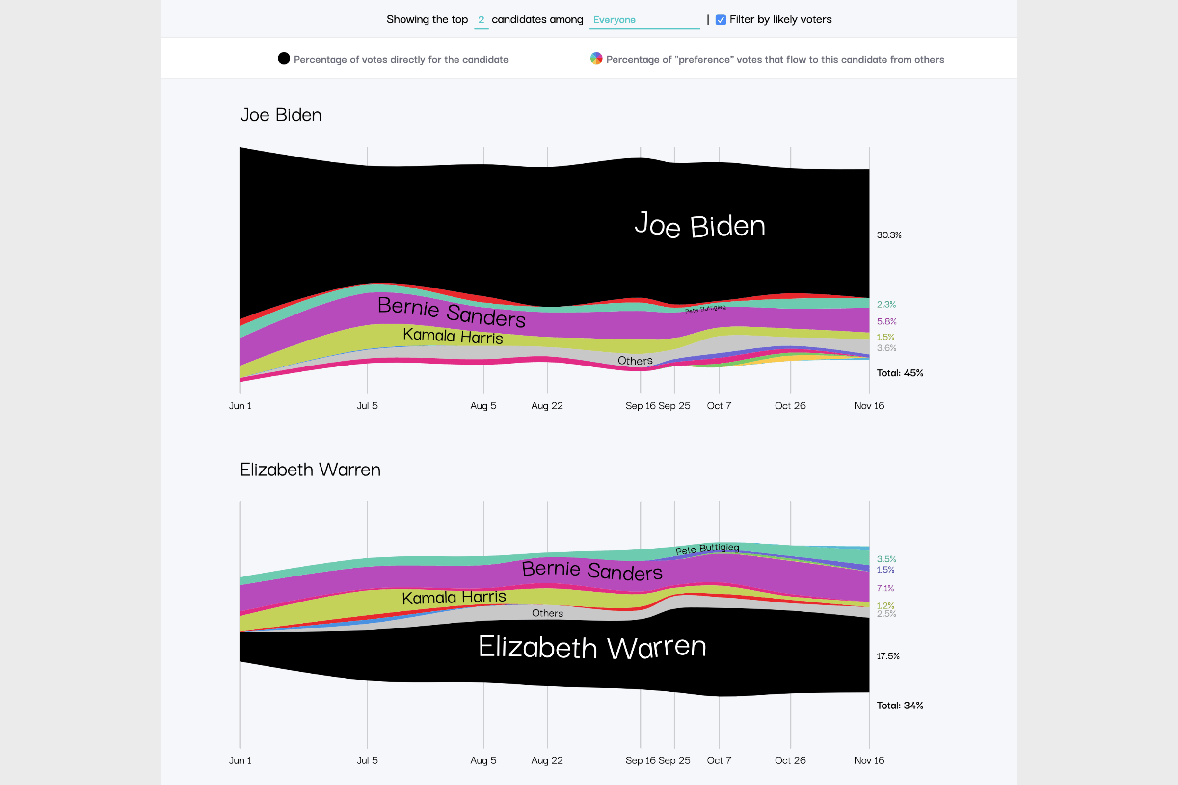
The tricky part of this project was to convey the essence of the results of an instant-runoff election. To see which voters flow to the most popular overall candidates when that person’s preferred choice has been eliminated. I create 5-6 different designs, each having their own strengths and weaknesses (both in an interpretation, data and technical aspect). After discussing these with Swayable, I continued with two of the designs.
The first focuses on revealing a clear point in time, the result of one poll. For this I used a Voronoi Map, through the d3-voronoi-map plugin, which lends itself very well to the data (showing parts of the whole), and also has a visually pleasing and unique look (with thanks to kind help from its creator on some finer technical points).
For the second prototype I used a Streamgraph to reveal the change in preferences across time, which is, like the Voronoi Map, also rooted in more “natural” shapes.